Users with access to Revenue Intelligence can see recent changes to forecast category
metrics on a flow chart, and all Pipeline Inspection users can view pipeline changes metrics on a
waterfall chart. The charts show the changes to opportunities for the different sets of metrics
over time. Filter results to see the most relevant data.
Required Editions
Available in: Lightning Experience
Available in: Enterprise, Performance, and Unlimited
Editions with Sales
Available with Revenue Intelligence, which is available for an additional cost
in: Enterprise and Unlimited Editions
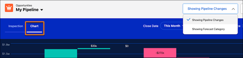
To access charts in Pipeline Inspection, go to the Chart tab. To see the flow chart, select
Forecast Category in the Metrics dropdown. To see the waterfall chart,
select Pipeline Changes in the Metrics dropdown menu. The metrics and
charts you can see depend on the settings enabled.
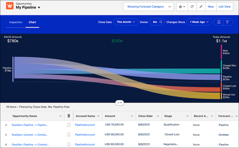
Flow Chart
The flow chart shows the change in opportunity forecast categories according to your filter
criteria. To specify the opportunities that you want to focus on, use the filters for close date
and user. Also, specify the time period that you want to show in the chart.
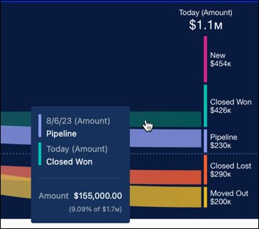
The chart shows pipeline changes starting from the date that you choose to the present day. To
highlight the changes related to that forecast category, click a band in the chart. The list
below the chart also updates to show opportunities related to your selection.
The data shown in the chart is for individual forecast categories. You can select from amount,
currency, or number fields to summarize metrics in Pipeline Inspection and the flow chart, based
on what your Salesforce admin configured. For example, use a currency field to see data for
annual recurring revenue, or use a number field to view product quantities.
The forecast categories are defined by Salesforce, and sometimes they don’t correspond
precisely to the labels of the forecast categories that you use. Your admin can customize the
labels.
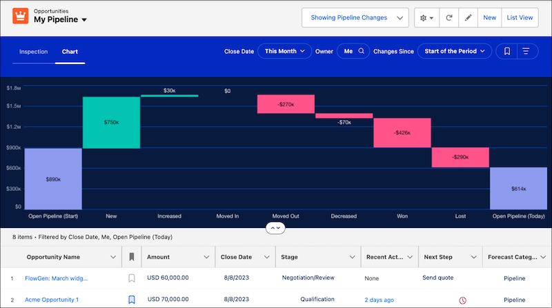
Waterfall Chart
The waterfall chart shows changes in pipeline categories such as opportunities created,
increases and decreases in your pipeline, and won and lost amounts. It also shows amounts for
opportunities moved in and out of the period. You specify the opportunities to view using the
quick filters for close date and user and then the time period to show.
The chart data shows the net change to the pipeline over the selected period. The fields
used to summarize your data are the same as the fields used for the flow chart and are based on
the fields your admin configured.
The metrics names, such as New, Increased, and Won, in the
pipeline changes metrics group shown in the waterfall chart are specified by Salesforce and
can’t be changed.
Note The charts don’t support Expected Revenue and Quantity as summary
fields.
We use three kinds of cookies on our websites: required, functional, and advertising. You can choose whether functional and advertising cookies apply. Click on the different cookie categories to find out more about each category and to change the default settings.
Privacy Statement
Required Cookies
Always Active
Required cookies are necessary for basic website functionality. Some examples include: session cookies needed to transmit the website, authentication cookies, and security cookies.
Functional Cookies
Functional cookies enhance functions, performance, and services on the website. Some examples include: cookies used to analyze site traffic, cookies used for market research, and cookies used to display advertising that is not directed to a particular individual.
Advertising Cookies
Advertising cookies track activity across websites in order to understand a viewer’s interests, and direct them specific marketing. Some examples include: cookies used for remarketing, or interest-based advertising.