
You are here:
Revenue Insights Dashboard
Get a comprehensive view of your revenue performance from the Overview tab. Your most critical information is instantly available. The chart helps point to the areas to focus on, such as whether opportunities are moving to the next stage. Quickly determine whether sales are trending up or down with details such as average win rates, days to close, and average sales size.
The Revenue Insights Dashboard
Revenue Insights includes the following tabs:
- Overview: Get a comprehensive view of your revenue performance from the Overview tab.
- Team: Quickly identify opportunities for managers to coach or representatives to work on performance. See details, such as the sales leader, average win rate, open pipeline, and activities completed. It’s easy to assess the top accounts, opportunities, and products, so you know where to focus your efforts.
- Sales Performance: The Revenue Insights Sales Performance tab shows how your sales are trending over time. Compare by product area, month, or quarter to see whether sales are trending up or down.
- Forecast Historical Trend: If you’ve enabled historical trending on the forecast item object, you can view the new forecast historical trend chart in Revenue Insights.
The Revenue Insights Overview Tab
The Overview tab includes an overview chart that is designed to give you a high level view of your pipeline, teams, and sales.
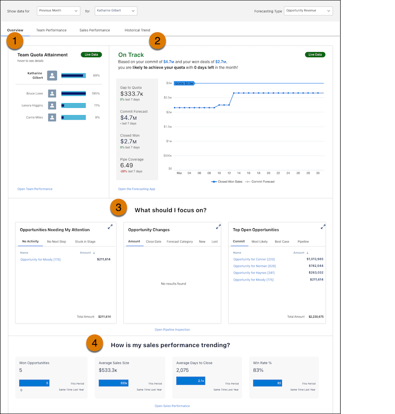
In Team Quota Attainment, you can see, at-a-glance how close your team members are to reaching their quotas (1). In the On Track/Off Track chart, you can easily understand your gap to meeting your quota goals (2). In the What should I focus on? section, you can easily determine the next steps to take to meet your quotas. You can see what opportunities need attention, what changes have occurred in your opportunities, and details about your top open opportunities, including what stage they are in (3). Lastly, follow your bottom line in the How is my sales performance trending? section (4).
KPI Calculations for My Team’s Quota Attainment.
When you view the My Team's Quota Attainment chart, you can see quota status for your team members.
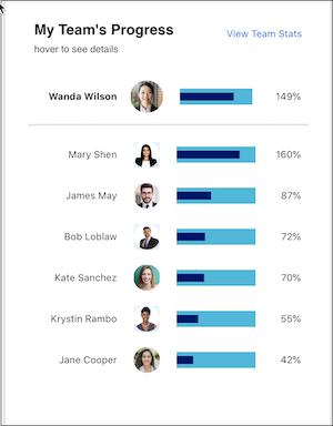
The quota attainment metric represents the percentage of closed won to quota.
KPI Calculations for On Track/Off Track Chart
The On Track/Off Track chart shows the following metrics:
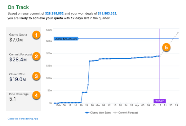
- Gap to Quota: Quota minus Closed Won (1).
- Commit Forecast: The total amount of all Open Opportunities where the Forecast Category is equal to Commit (2).
- Closed Won: The total amount of all Closed Won Opportunities (3).
- Pipe Coverage: Open Pipeline divided by Gap to Quota (4).
- Commit Forecast axis: Shows the line from Today to Commit Forecast (5).
KPI Calculations for Opportunities Needing My Attention
The Opportunities Needing My Attention chart shows the following metrics:
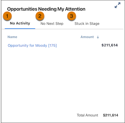
- No Activity: This metric can be one of two measures. No recent activity (Open opportunities with no activity in the last fourteen days), or No upcoming activity (Open opportunities with no activities scheduled in the future from today) (1).
- No Next Step: Open Opportunities where the Next Step field is blank (2).
- Stuck in Stage: Opportunities that have been in the same stage for more than fourteen days longer than the average days in the stage (3).
All of the charts in the What should I focus on? sections show the top fifty Opportunities by amount for the top area columns. Totals are calculated by using all Opportunities that meet the criteria.
KPI Calculations for Opportunity Changes.
The Opportunity Changes chart shows the following metrics:
- Amount: Open Opportunities where the Amount field has changes in the last seven days.
- Row level: Shows Opportunity Amount and the change in Amount.
- Aggregate level: Shows the total net Opportunity Amount changed over the last seven days.
- Close Date: Open Opportunities where the Close Date field has changes in the last seven days.
- Row level: The old Close Date and new Close Date display.
- Aggregate level: Shows the total number of opportunities whose date moved in or moved out in the last seven days.
- Forecast Category: Open Opportunities where the Forecast Category field has changes in the
last seven days.
- Row level: The old Forecast Category and new Forecast Category display.
- Aggregate level: The total number of opportunities with forecast category changes.
- New: Open Opportunities that have been created in the last seven days.
- Lost: Closed Lost Opportunities in the last seven days.
All of the charts in the What should I focus on? section shows the top fifty Opportunities by amount for the top area columns. Totals calculated by using all Opportunities that meet the criteria.
Click the pop-out button to see more details of the opportunity changes.
KPI Calculations for Top Open Opportunities
The Top Open Opportunities chart shows the following metrics:
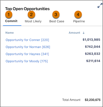
- Commit: Open Opportunities where the Forecast Category is Commit (1).
- Most Likely: Open Opportunities where Forecast Category is Most Likely (2).
- Best case: Open Opportunities where the Forecast Category is Best Case (3).
- Pipeline: Pipeline:Open Opportunities where the Forecast Category is Pipeline (4).
All of the charts in the What should I focus on? section show the top fifty Opportunities by amount for the top area columns. Totals calculated by using all Opportunities that meet the criteria
KPI Calculations for How Is My Sales Performance Trending?
The How is my sales performance trending? chart shows the following metrics:
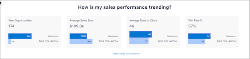
- Won Opportunities: Total number of Closed Won Opportunities.
- Average Sales Size: The sum of all Closed Won Opportunities divided by the total number of Closed Won Opportunities.
- Average Days to Close: The sum of CloseDate minus CreatedDate for all Closed Won Opportunities divided by the total number of Closed Won Opportunities.
- Win Rate %: The percentage of Closed Won Opportunities to Closed Opportunities (including both won and lost).
- Revenue Insights Team Tab
Quickly identify opportunities for managers to coach or representatives to work on performance. See details, such as the sales leader, average win rate, open pipeline, and activities completed. It’s easy to assess the top accounts, opportunities, and products, so you know where to focus your efforts. - Revenue Insights Sales Performance Tab
The Revenue Insights Sales Performance tab shows how your sales are trending over time. Compare by product area, month, or quarter to see whether sales are trending up or down. - Revenue Insights Forecast Historical Trend Tab
If you’ve enabled historical trending on the forecast item object, you can view the new forecast historical trend chart in Revenue Insights.