
You are here:
Add Widgets to the Dashboard
Widgets are the basic building blocks of a dashboard. In the dashboard designer, you can add different widgets to perform functions. For example, widgets can calculate key performance indicators, filter dashboard results, visualize your data using interactive charts, and show record-level details in tables.
Watch a Demo:  Get to Know Wave Dashboard Widgets (English
Only)
Get to Know Wave Dashboard Widgets (English
Only)
Widgets that display data require a query. A widget determines how to use or display the results returned by a query. For example, a query calculates the average opportunity amount, grouped by region. A bar chart widget displays the results in a bar chart format with each bar showing the average opportunity amount for a region. If the query is faceted, when you select a bar in the chart, other widgets are filtered, showing results for only the selected region.
Most widgets have a wizard that you can use to build the widget, including the underlying query. You can also build your own custom query and apply it to a widget. Multiple widgets can use the same query, unless it's a date or range widget.
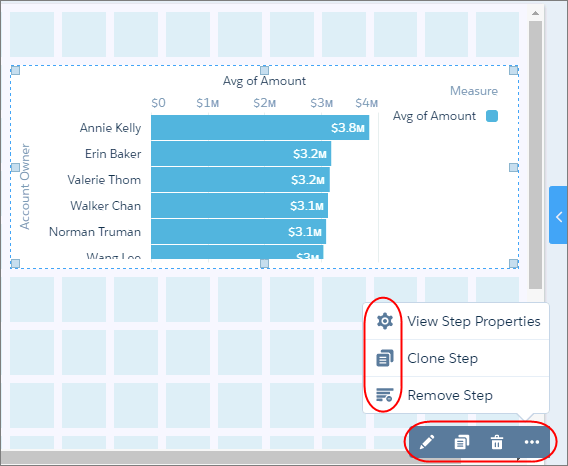
Clone widgets to create similar looking components in a CRM Analytics dashboard. For example, you can clone a chart widget and change the chart type to get a different view of the same results. When you clone a widget, you also clone its query. You can also quickly create three number widgets by cloning one of them and modifying their queries’ filters to show total open, total won, and total lost opportunity amounts. To clone widgets, remove queries, clone queries, and view query properties, select the widget while editing the dashboard, and then click the appropriate button.
To configure how a widget appears, set the properties in the Widget tab. For example, you can show data values and the axis title for a chart widget. You can also apply default properties to ensure that widgets look consistent, like having the same border and background color.
To configure how the widget behaves, set query properties in the Query tab. For example, you can choose which measure to display in the widget when its query contains multiple measures. Changes to query properties impact all widgets that are built on the query.
When you save the new version of your dashboard, it’s a good idea to enter a brief description of your changes to the Version History field. The description can help you remember what’s unique about this version of the dashboard in case you want to restore this version after you make changes and save a new version. For example, enter Added Number Widget.
- Add Number Widgets to Include Key Metrics
Key metrics help you track critical measurements of your business. For example, you can show the total number of open cases or total opportunity amount for the last quarter or the northern region. - Add Chart Widgets to Visualize Data
Charts in a CRM Analytics dashboard allow you to visually summarize and trend your data. For example, a donut chart can show the distribution of opportunities across industry type. - Add a Global Filter Panel Widget to Filter Data from the Dashboard
The panel can contain single or multiple global filters. Use a global filter to apply the same filter to multiple queries in the dashboard. For example, a dashboard has two charts comparing two sales reps’ performance. To compare apples to apples, both charts must have the same filters. When possible, use a global filter instead of a selection-based filter to improve dashboard performance. If configured, users can change a global filter while viewing the dashboard. - Add Selection-Based Filter Widgets to Enable Users to Filter the Results
Users viewing the dashboard can make selections in these types of widgets, which filter the results of other faceted widgets. Selection-based filter widgets give users the ability to slice and dice the data to view results from different angles. For example, the dashboard viewer can select a region in a list widget to focus the dashboard results on a specific sales location. Unlike with a filter defined by a query, the viewer can filter the results differently (by making another selection) or remove the filter altogether. - Add a Table Widget to Show Record Details and Create Calculated Columns
You can add different types of tables to a CRM Analytics dashboard. To view record-level details, add a values table. A values table can show details like how long a case has been open and who owns it. To create custom columns in a table based on calculations from existing fields, add a compare table. If the underlying query contains at least one grouping, you can create a pivot table. - Add a Container Widget to Create Sections in the Dashboard
Use a container in a CRM Analytics dashboard to group related widgets. For example, you can use a container widget to create a filter panel on the left side of the dashboard to store all selection-based filter widgets. To distinguish the filter panel from the rest of the dashboard, you can apply a background color and border to the container. When you move this widget, the contained widgets also move while maintaining their spacing and alignment. - Add an Image Widget to Display Graphics in the Dashboard
You can include company logos to brand the CRM Analytics dashboard, icons to categorize results, or graphics to animate the dashboard. - Enrich Your Data with Dashboard Text
Use text widgets to emphasize important data, make your dashboards more scannable, and tell a more compelling data story. - Add a Navigation Widget to Access Dashboard Pages
Give dashboard viewers an easy way to navigate dashboard pages with a navigation widget. Reuse your navigation widget for a consistent look across dashboard pages. - Add a Link Widget to Link to Other Assets
Take dashboard viewers straight to where they need to go with links to specific assets, like dashboards, pages, queries, lenses, and even web pages. You can also use links to create analysis paths for users to follow, helping them navigate your analytics app, or to perform mass quick actions on record lists. - Widget Properties for Analytics Dashboard
Widget properties define how widgets appear in the Analytics dashboard. For example, you can apply labels, backgrounds, and borders. To make widgets look consistent, you can set up default widget properties in the layout and then assign them to each widget. Widget properties vary based on the widget type and the designer used to create them. The properties listed here apply only to widgets created in the dashboard designer.