Loading
Salesforce now sends email only from verified domains. Read More
Tableau Next
Table of Contents
Select Filters

          No results
          No results
          Here are some search tips

          Check the spelling of your keywords.
          Use more general search terms.
          Select fewer filters to broaden your search.

          Search all of Salesforce Help
          Highlight Metric Value Changes in a Waterfall Chart

          Highlight Metric Value Changes in a Waterfall Chart

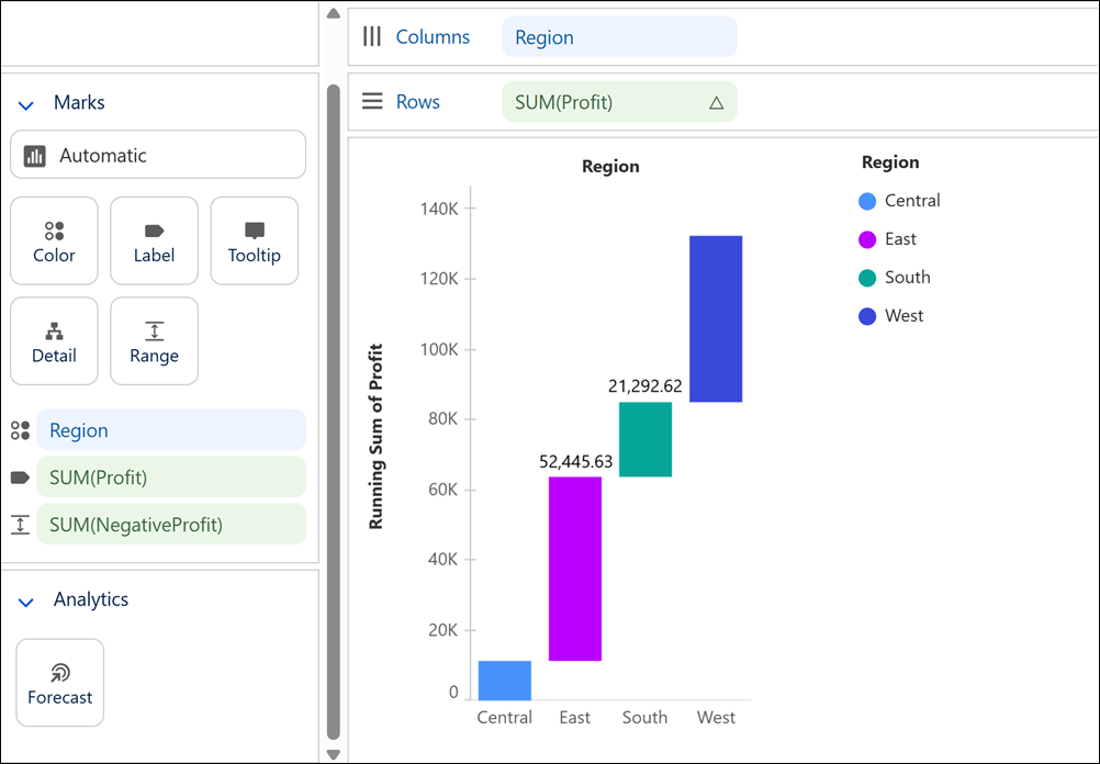
          Visualize how a key value evolves over time or across categories by showing the cumulative effect of both positive and negative changes in a waterfall chart. This chart type, based on a bar chart, is ideal for highlighting the net effect each individual value has on the final value. For example, using your sales order data, create a waterfall chart to compare how each business region contributes to total profit.

          Required Editions

          View supported editions.
          User Permissions Needed
          To create Tableau Next visualizations: Tableau Unmetered Platform Analyst or Tableau Next Platform Analyst permission set
          1. From the Data pane in your visualization, drag the dimension field used to analyze the measure onto Columns. For the chart in the example, select Region.
          2. Drag a measure field, such as Sum of Profit, onto Rows.
          3. To show the cumulative aggregate of the measure over time or across categories, from the measure field’s context menu, select Quick Table Calculation > Running Total.
          4. To visualize decreases in the measure’s value alongside increases, add a calculated field that returns the negative of the measure.
          5. Drag the calculated field onto the Range encoding to show the cascading effect of the measure values.
          6. Optionally, you can add more details to the waterfall chart.
            1. For example, to view the value of each bar, drag Sum of Profit onto the Label encoding.
            2. To view each bar in a different color, drag Sum of Profit onto the Color encoding. To apply custom colors, such as green for profit and red for loss, use a calculated field that returns discrete values for colors.
          7. Apply your changes.

          Waterfall chart that shows how each business region contributes to total profit.

           
          Loading
          Salesforce Help | Article