
You are here:
Explore the Dashboards
The Admissions Connect Tableau Accelerator includes multiple dashboards.
Application Status values are grouped in these buckets.
-
Complete: Accepted Offer, Admit, Admit with Conditions, Declined Offer, Deferred Offer, Deny
-
In Progress: In Review, Incomplete, Received, Submitted, Waitlist
To change these buckets, edit the Application Status (group) in the workbook.
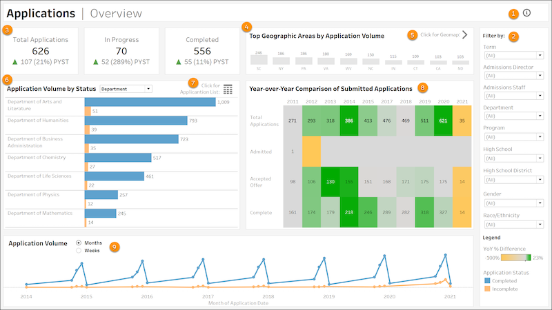
Applications Overview
Get a bird’s eye view of your institution’s current and historical applications. To view this dashboard, select the Applications Overview tab.
-
Hover over the icon to learn more about this dashboard and how you can use it (1).
-
Filter data by Term, Admissions Director, Admissions Staff, Department, Program, High School, High School District, Gender, and Race/Ethnicity (2).
-
KPI tiles show total applications, applications in progress, and applications complete. The tiles also compare the current term’s total to the prior year’s same term total. For example, Fall 2021 is compared to Fall 2020. PYST stands for Prior Year, Same Term (3).
-
The top 10 U.S. states with the highest volume of applications (4), shown by state or by country. Click a Geographic Area name to open the Geographic Map dashboard to view data by state, county, and ZIP code. Or you can open the Geographic Map dashboard to view the data for all areas (5).
-
The top 10 items selected by application volume. By default, data is shown for Department, but you can see data for Admissions Director, Admissions Staff, Program, High School, and High School District (6). You can also view the full Application List by specific filters, such as High School or Application Date (7).
-
Year-over-year comparison of application volume. Hover over values for additional information (8).
-
The total application volume over months or weeks based on the Application Date for submitted applications, by default over the last 8 years (9).
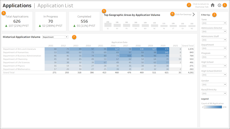
Application List
View historical application volume data for Departments, Admissions Director, Admissions Staff, Program, High School, and High School District. To view this dashboard, select the Application List tab.
-
Hover over the icon to learn more about this dashboard and how you can use it (1).
-
Go to the Overview dashboard (2).
-
Filter data by Term, Admissions Director, Admissions Staff, Department, Program, High School, High School District, Gender, and Race/Ethnicity (3).
-
KPI tiles show total applications, in-progress applications, and completed applications. The tiles also compare the current term's total to the prior year's same term total. For example, Fall 2021 is compared to Fall 2020. PYST stands for Prior Year, Same Term (4).
-
The top 10 U.S. states with the highest volume of applications, shown by state or by country (5). Click a Geographic Area name to open the Geographic Map dashboard to view data by state, county, and ZIP code.
-
Go to the Geographic Map to see application data by geographic region (6).
-
Historical application volume for selected item (7). By default, data is shown for Department, but you can change your selection to see data for Admissions Director, Admissions Staff, Program, High School, or High School District.
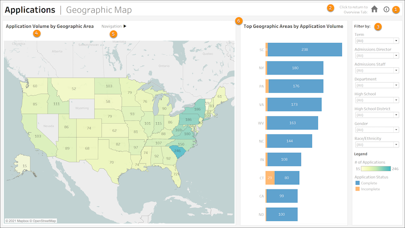
Geographic Map
Use an interactive map to navigate from state, county, geomarket code, and ZIP code. To view this dashboard, select the Geographic Map tab.
-
Hover over the icon to learn more about this dashboard and how you can use it (1).
-
Go to the Overview dashboard (2).
-
Filter data by Term, Admissions Director, Admissions Staff, Department, High School, High School District, Gender, and Race/Ethnicity (3).
-
A geographic map showing application by U.S. state (4). The coloring scheme indicates the number of applications in a given geographic area. Click a state to view detailed application data for related counties and ZIP codes.
-
Select a state, county, or ZIP code for additional information (5).
-
Application data for the top 10 geographic areas in your current view (6). By default, the 10 states with the most applications are shown. When you select a county or ZIP code, the list shows the top 10 counties or ZIP codes with the most applications.
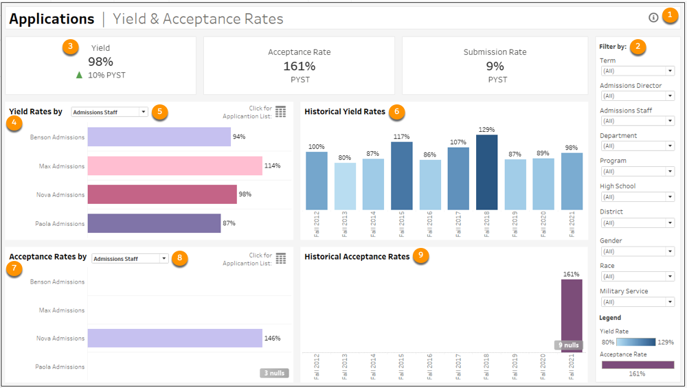
Yield and Acceptance Rates
Review your institution’s yield and acceptance rates. The Yield data reflects the percentage of total students enrolled compared to the total number of students accepted. Submission Rate percentage is the Applications Submitted divided by the Total Applications. The Acceptance Rate is the percentage of Applications Accepted compared to the number of Applications Submitted. To view this dashboard, select the Application Yield & Acceptance tab.
-
Hover over the icon to learn more about this dashboard and how you can use it (1).
-
Filter data by Term, Admissions Director, Admissions Staff, Department, Program, High School, High School District, Gender, Race/Ethnicity, and Military Service (2).
-
KPI tiles show total yield percentage, acceptance rate percentage, and submission rate percentage. The tiles also compare the current term's total to the prior year's same term total. For example, Fall 2021 is compared to Fall 2020. PYST stands for Prior Year, Same Term (3).
-
The Yield Rates by Admissions Staff show by default, but you can see the rates by Admissions Director, Program, Department, Program, High School, and School District (4). Hover over values for more information. You can also view the full Application List by specific filters, such as High School or Application Date (5).
-
The Historical Yield Rates show by academic year. Hover over values for more information (6).
-
Acceptance Rates by Department are shown by default, but you can see rates by Admissions Director, Admissions Staff, Program, High School, or School District (7). You can also view the full Application List by specific filers, such as High School or Application date. Hover over values for more information (8).
-
Historical Acceptance Rates show by school year. Hover over values for more information (9).
Pipeline Counts and Rates
Get a detailed overview of your institution’s pipeline counts and rates. To view this dashboard, select the Applications Pipeline tab.
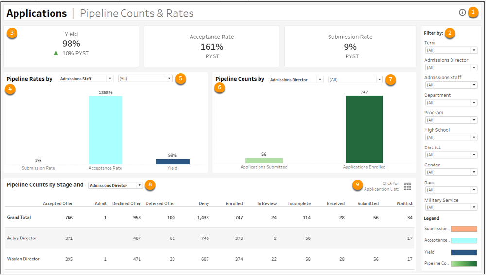
-
Hover over the icon to learn more about this dashboard and how you can use it (1).
-
Filter data by Term, Admissions Director, Admissions Staff, Department, Program, High School, High School District, Gender, Race/Ethnicity, and Military Service (2).
-
The Pipeline Rates by Admissions Staff show by default, but you can see rates by Admissions Director, Program, Department, High School, and School District. Hover over values for additional information (4). You can further filter the data by specific staff members, departments, programs, schools, or districts. (5). Hover over values for more information.
-
Pipeline Counts by Admission Director show by default, but you can see counts for Admissions Staff, Department, Program, High School, or School District (6). You can further filter the data by specific staff members, departments, programs, schools, or districts. (7). Hover over values for more information.
-
Pipeline Counts by Stage and Admissions Staff show by default, but you can see counts by Stage and Admissions Director, Department, Program, High School, or School District. The table provides count data for Accepted Offer, Admit, Declined Offer, Deny, Enrolled, In Review, Incomplete, Received, Submitted, and Waitlist. Hover over values for more information (8). You can also view the full Application List by specific filters, such as High School or Application Date (9).
Application List II
Get a general and historical perspective on your institution’s application yield, acceptance rate, submission rate, and application volume data. To view this dashboard, select the Application List — II tab.
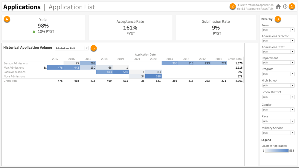
-
Hover over the icon to learn more about this dashboard and how you can use it (1).
-
Go to the Application Yield & Acceptance Rates tab (2).
-
Filter data by Term, Admissions Director, Admissions Staff, Department, Program, High School, School District, Gender, Race, and Military Service (3).
-
KPI tiles show total yield percentage, acceptance rate percentage, and submission rate percentage. The tiles also compare the current term's total to the prior year's same term total. For example, Fall 2021 is compared to Fall 2020. PYST stands for Prior Year, Same Term (4).
-
Use the dropdown list to view the Historical Application Volume data by Admissions Staff, Admissions Director, Department, Program, High School, or School District. Admissions Staff is selected by default. Hover over values for more information (5).