
You are here:
Tableau for Advanced Reporting
Use Tableau Dashboard Accelerators with Salesforce to turn your client and program data into actionable insights that can help you improve your program performance and increase your organization's impact.
For example, get insights about things like how well your clients are being served, if your services are leading to successful program completion, and if your organization is on track for meeting service delivery goals. For details, see Tableau Dashboard Accelerators.
If you already use Tableau, simply connect Tableau to your Salesforce org to start with ready-made dashboards, then customize the dashboards to fit your data needs. If you're new to Tableau, purchase at least one Creator license to get started, or check to see if you're eligible for a Tableau license donation. You can also start a free 14-day trial.
- Connect Tableau to Salesforce
Connect your Tableau Online or Tableau Desktop account to Salesforce. - Best Practice for Tableau Dashboard Accelerators
To maximize the benefits of your Tableau Dashboard Accelerators, follow the best practices whenever possible. - Explore the Dashboards
Gain valuable insights into your client and program data by using the CRM Analytics dashboards.
Connect Tableau to Salesforce
Connect your Tableau Online or Tableau Desktop account to Salesforce.
Use Tableau Online
-
Go to Tableau Online and log in.
-
On the home page, click Dashboard Starters. If you didn't land on the home page, click Home, then click See All.
-
On the Starters page, set your Data Sources filter to Salesforce.
-
Click the Dashboard Starter that you want to use.
-
Click Sign in to Salesforce and log in.
Use Tableau Desktop
- Download the Salesforce Nonprofit Program Management accelerator.
-
From the Tableau Desktop home page, click the workbook you want to open.
-
In the Data menu, select each data source that you want to use, then select Edit Data Source .
-
Log in and select Allow to give access to your data.
 Note If worksheets are blank, navigate to the worksheet, then replace reference fields by right-clicking on the fields with red exclamation marks as necessary.
Best Practice for Tableau Dashboard Accelerators
To maximize the benefits of your Tableau Dashboard Accelerators, follow the best practices whenever possible.
-
Keep your dashboards fresh with the most current data in your org. See Keep Data Fresh.
-
Customize your dashboards with formatting to enhance analysis and presentation. See Format Your Work. You can also remove filters that aren't relevant and add your own.
-
Export Tableau data to various file types for use in presentations or other communications.
-
Get help by logging a support case with Tableau.
Explore the Dashboards
Gain valuable insights into your client and program data by using the CRM Analytics dashboards.
- Intake
See if your clients are being served in a timely manner using the Intake dashboard. Access this dashboard from the Intake tab. - Client Enrollment and Participation
See an overview of your clients and the programs they're enrolled in using the Client Enrollment and Participation Trends dashboard. Access this dashboard from the Clients tab. - Service Delivery Trends
See a high-level view of Service Delivery trends and learn if you're on track to meet Service Delivery goals using the Service Delivery Trends dashboard. Access this dashboard from the Service Delivery tab. - Client Assessments
See how clients are performing based on Services used and Assessments using the Client Assessments dashboard. Access this dashboard from the Assessments tab. - Staff Capacity & Client Service
See how staff are performing and managing clients using the Staff Capacity & Client Service dashboard. Access this dashboard from the Staff Capacity tab. - Additional Resources
Check out these resources to learn more about Tableau.
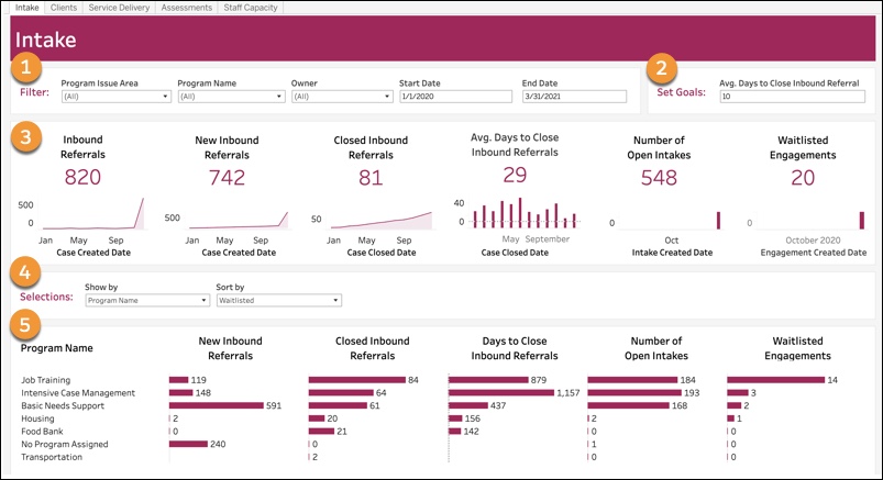
Intake
See if your clients are being served in a timely manner using the Intake dashboard. Access this dashboard from the Intake tab.
-
Filter data by Program Issue Area, Program Name, Owner, or a date range (Start Date and End Date).
-
Set Goals: Select a number of average days to close an Inbound Referral. This will change the line of the Average Days to Close Inbound Referral chart.
-
Charts:
-
Inbound Referrals: Number of Inbound Referral Cases created by month.
-
New Inbound Referrals: Number of Inbound Referral Cases with a status of New, by month.
-
Closed Inbound Referrals: Number of Inbound Referrals with a status of Closed, by month.
-
Average Days to Close Inbound Referrals: The difference between the Case Created Date and Case Closed Date. Compare this to the goal that you set.
-
Number of Open Intakes: Number of Intake records where the stage is Not Started, In Progress, Awaiting Client Input, or In Review, by month the Intake was created.
-
Waitlisted Engagements: The number of Program Engagements with a status of Waitlisted, by month.
-
-
Selections: Show by Program Name, Program Issue Area, or Owner. Sort by New Inbound Referrals, Closed Inbound Referrals, Days to Close Inbound Referrals, Open Intakes, or Waitlisted. Sort by keeps your Show by selections, but further determines the order in which rows appear.
-
Same charts shown as #3, shown with further detail based on your Show by selections.
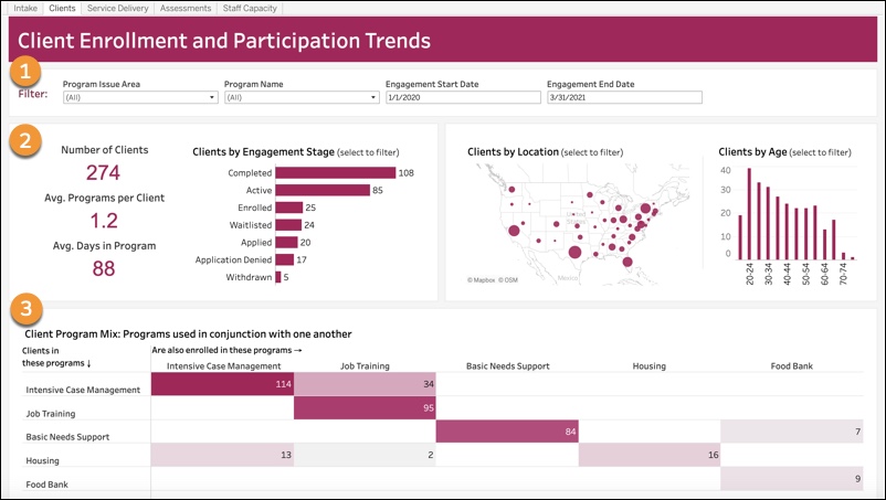
Client Enrollment and Participation
See an overview of your clients and the programs they're enrolled in using the Client Enrollment and Participation Trends dashboard. Access this dashboard from the Clients tab.
-
Filter: Filter data by Program Issue Area, Program Name, or a date range (Engagement Start Date and Engagement End Date).
-
Charts:
-
Number of Clients: How many unique participants had Program Engagements in any status.
-
Average Programs per Client: How many Program Engagements each Contact has.
-
Average Days in Program: Time between the Program Engagement's start date and either end date or today's date, if there isn't an end date.
-
Clients by Engagement Stage: Shows current Program Engagements.
-
Clients by Location: Larger circles represent more clients. The map can be changed from US to another geographic location.
-
Clients by Age: Grouped into default age buckets of 5 years, but can be customized.
-
-
Client Program Mix: Programs used simultaneously. For example, 114 clients are enrolled in intensive case management; 34 of those 114 are also enrolled in job training.
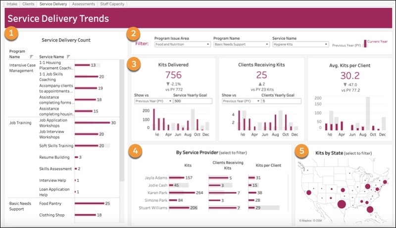
Service Delivery Trends
See a high-level view of Service Delivery trends and learn if you're on track to meet Service Delivery goals using the Service Delivery Trends dashboard. Access this dashboard from the Service Delivery tab.
-
Service Delivery Count: Shows all Programs and Services to show those used most often. This chart is not affected by the filters in #2.
-
Filter data by Program Issue Area, Program Name, or Service Name. Program Issue Area and Program Name narrow down options on the Service Name filter, and you must select a Service Name to use the charts. The Unit of Measurement associated with the selected Service Name dictates chart titles. This dashboard doesn't have a date range filter; it always shows year-over-year data.
-
Charts:
-
[Unit of Measurement] Delivered (for example, Kits Delivered): Choose to compare this year's data to the previous year or goal. If you choose the goal, enter the goal in Service Yearly Goal.
-
Clients Receiving [Unit of Measurement] (for example, Clients Receiving Kits): Choose to compare this year's data to the previous year or goal. If you choose the goal, enter the goal in Clients Yearly Goal.
-
Average [Unit of Measurement] per Client (for example, Average Kits per Client): Service delivered divided by the clients receiving the Service.
-
-
By Service Provider: Shows the same data as shown in #3, broken down by Service Provider.
-
[Unit of Measurement] by State (for example, Kits by State): Larger circles represent more units. The map can be changed to another location or level or granularity.
Client Assessments
See how clients are performing based on Services used and Assessments using the Client Assessments dashboard. Access this dashboard from the Assessments tab.
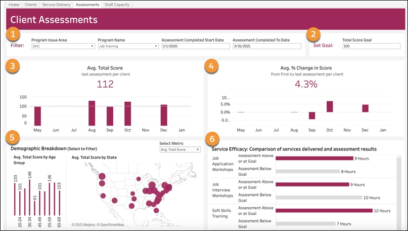
Filter data by Program Issue Area, Program Name, or a date range (Assessment Completed Start Date and Assessment Completed To Date). To add additional filters such as Record Type to compare types of Assessments, see Adding Filters to Dashboards in the Tableau Knowledge Base
.-
Set Goal: Set a Total Score Goal.
-
Average Total Score: Compares the total score field of the last Assessment for each client to the set goal.
-
Average % Change in Score: The change in Assessment scores between the first Assessment and the last, shown as a percentage.
-
Demographic Breakdown: Average Total Score by Age Group (grouped by age in 5-year increments, but this can be customized) and Average Total Score by State. Larger circles represent a higher average score. The map can be changed to another location or level of granularity.
-
Service Efficacy: Compares Services delivered and Assessment results.
Staff Capacity & Client Service
See how staff are performing and managing clients using the Staff Capacity & Client Service dashboard. Access this dashboard from the Staff Capacity tab.
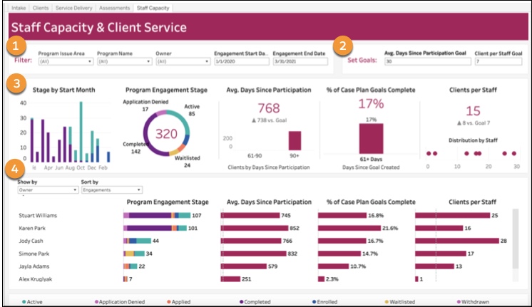
-
Filter data by Program Issue Area, Program Name, Owner, or a date range (Engagement Start Date and Engagement End Date).
-
Set Goals: Set Average Days since Participation Goal and Client per Staff Goal.
-
Charts:
-
Stage by Start Month: Shows Program Engagements based on the month the Program Engagement started, with the colors indicating the current stage. Refer to the legend at the bottom to see which color corresponds to which stage.
-
Program Engagement Stage: Shows the current Stage of all Program Engagements created during the selected date range.
-
Average Days Since Participation: Compared to goal, shows a breakdown by date range in 0-30, 31-60, 61-90, and 90+ day increments (for example, how many clients have participated in 0-30 days).
-
% of Case Plan Goals Complete: For all Case Plan Goals created during the time frame, what percentage are completed, and how many days they took to complete.
-
Clients per Staff: Total number of active Program Engagements divided by owners of Program Engagements.
-
-
Selections: Show by Program Name, Program Issue Area, or Owner. Sort by Engagements, Clients per Staff, Average Days Since Participation, or % of Goals Completed. Sort by keeps your Show by selections, but further determines the order in which rows appear.