
You are here:
Add a Datatable to a Flexcard (Managed Package)
For the managed package runtime, add the Datatable element in Flexcard Designer.
 This information is for Omnistudio for Managed Packages. For Omnistudio on standard runtime, see Omnistudio Help.
For a list of datatable events, see Flexcards Datatable Properties (Managed Package).
- In the Flexcard Designer, drag a Datatable element from the Build panel into a state on the canvas.
- (Optional) From the Properties panel, update the element name in the Element Name field.
-
(Optional) Before Winter '22, to add an aria-label for accessibility users only
visible in assistive technologies, enter a name in the Datatable
Name field.
In Winter '22 only, enable Accessibility Support under Attributes to display the Datatable Name field. Enabling Accessibility Support also adds
roleattributes to the datatable's HTML to indicate its structure for assistive technologies.Beginning Spring '22, Accessibility Support and Datatable Name aren't supported.
-
To update columns, perform the following tasks:
-
Click the pencil icon next to Column to launch the Add DataTable Columns window and configure columns as follows:
-
To add an available data field column, click Add Column.
-
To delete a data field column, click the trash icon of the data field to remove.
-
To update data field column labels, click into a field under Field Label.
-
To update the ability to sort a specific data field column, change the value for Is Sortable to false or true. Is Sortable must be selected under Attributes in the Properties panel.
 Note
NoteBeginning Spring '22, click the sortable column once to sort descending, a second time to sort ascending, and a third time to reset the datatable to its state before sorting. If Draggable is enabled, clicking on a sortable column the first time disables the ability to drag a row. Selecting the same sortable column a third time enables you to drag a row.
-
To update the ability to search a specific data field, change the value for Is Searchable to true or false. Is Searchable must be selected under Attributes in the Properties panel.
-
To update the type of data for a specific data field column, such as currency, date, number, update Type.
-
To update the ability to edit the value of a data field, change the value for Is Editable to true or false. Cell Level Edit must be checked under Attributes in the Properties panel.
-
To update the ability for a user to hide or show specific data field columns, change the value for Is User Selectable to true or false. User Selectable Column must be checked under Attributes in the Properties panel.
-
To update whether a data field is hidden or shown by default, change the value for Is Visible to true or false. If this property is set to false and Is User Selectable is set to true, the user can make the column visible.
-
-
Click Save.
-
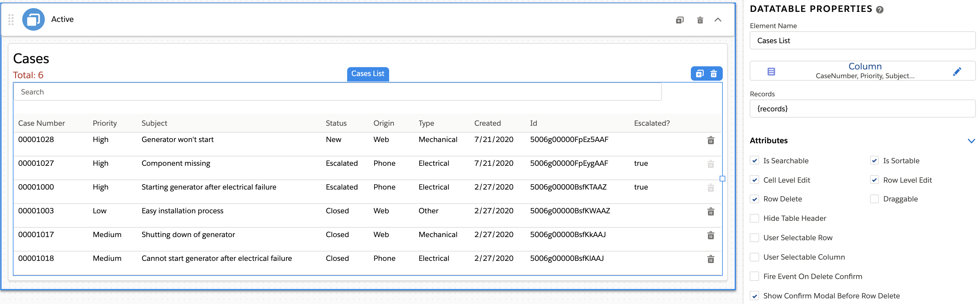
- Records gets the records to display in the datatable. Default is {records}, which displays all records returned from the data source.
-
(Optional) In the Attributes section, configure additional
properties:
-
To add pagination to the data table, enter values for the following properties:
-
Page Size: To set how many records per page to display, enter a number.
-
Page Limit: To set a max number of pagination links to display, update default number.
-
-
To enable the ability to delete a row based on a data field value returning as false, enter the name of the data field column in Row Delete Dependent Column in the Attributes section.
For example, let's say your table is a list of account cases and has a record field IsEscalated whose value is either true or false. When a record's IsEscalated value is false, a user can delete the record. If true, the trash icon is disabled and a user can’t delete the record.
Deleting a row fires the
deleteevent. Important
Row Delete must be enabled, and the column must have a boolean (true or false) value.
-
To make rows selectable by adding a checkbox at the beginning of each row, select User Selectable Row.
Selecting a row fires the
selectrowevent. -
To configure additional attributes see Flexcards Datatable Properties (Managed Package).
-
-
(Optional) To group a table by a data field type, in the Group
Attributes section, perform the following tasks:
-
In the Group By field, enter the name of the data field to group records by. For example, to group Account Cases by the Status data field, enter Status.
-
(Optional) Configure these properties:
-
Sort Across Groups: Sort across all groups.
By default, sorting happens within each group.
-
Hide Extra Column: Remove the space below and above the group name.
-
Active Groups: Collapse or expand the grouped rows by default.
-
Group Wrapper Class: Add a class to each group. See Apply Custom CSS to an Element on a Flexcard.
-
Group Order: Update the order in which each group is sorted.
-
-
- (Optional) To add conditions that must be met for the element to display, see Add Conditions to a Flexcard Element (Managed Package).
- (Optional) To style your element, click Style to open the Style panel, and see Flexcards Datatable Style Properties (Managed Package).