
You are here:
Base UI and Card Templates (Managed Package)
For the managed package runtime, the following tables list the base templates that are available for use with Vlocity Cards. When editing a template, it’s best practice to clone the existing template first and to edit the cloned version.
 This information is for Omnistudio for Managed Packages. For Omnistudio on standard runtime, see Omnistudio Help.
Beginning with the Vlocity Summer '19 release, Vlocity supports Salesforce's Lightning Web Components programming model with Vlocity Lightning Web Components. Vlocity Lightning Web Components include components, functionalities, and templates exclusive to LWC Cards.
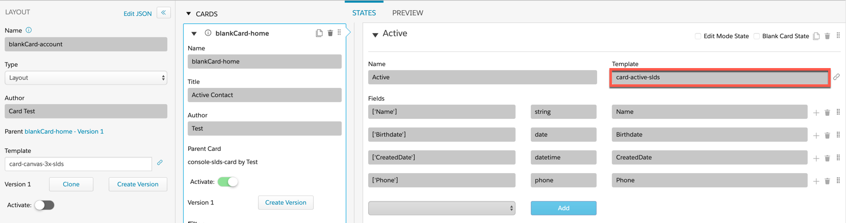
You can’t modify base Vlocity Cards authored by Vlocity. If you must edit the card, such as its configuration settings, card states, or data sources, clone the card.
Card and Card Layout Templates
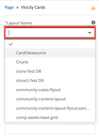
Apply Card and Layout templates in Vlocity Cards to control the information and actions that are available to a user. When active, the resulting Layout template becomes available in Vlocity Cards Component's Layout dropdown. The Vlocity Cards component is available in the Community Builder and the Lightning App Builder.
Card Layouts
Layout templates act as containers for Card templates and control how the cards display.
To apply a Layout Template:
-
In the Layout section of a Vlocity Card, ensure the Type is set to Layout.
-
Enter a Layout Template into the Template field.
Card Layout Template |
Description |
Card Layout Template Preview |
Compatible Card Templates |
|---|---|---|---|
One-column container |
Image unavailable |
action-grid-card action-grid-card-slds card-active-placeholders-slds card-active-slds card-active-slds-VlocityTrack card-highlight-totals card-horiz-actions-slds card-horiz-noActions-slds large-card-slds |
|
One-column container with search feature |
 |
action-grid-card action-grid-card-slds card-active-placeholders-slds card-active-slds card-active-slds-VlocityTrack card-highlight-totals card-horiz-actions-slds card-horiz-noActions-slds large-card-slds |
|
Three-column container with search feature |
 |
action-grid-card action-grid-cards-slds card-active-placeholders-slds card-active-slds card-active-slds-VlocityTrack card-horiz-open-slds card-open-slds card-simple-slds offer-card-active-slds |
|
Three-column card container with search feature and zones |
 |
action-grid-card action-grid-card-slds |
|
Simple column of cards |
Image unavailable |
action-grid-card action-grid-card-slds |
|
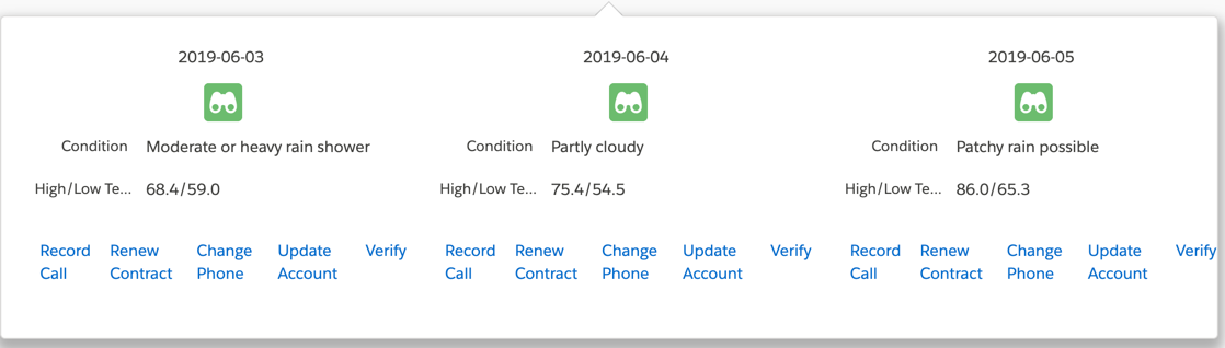
List template with infinite scrolling for records using pagination |
See list-card-canvas |
||
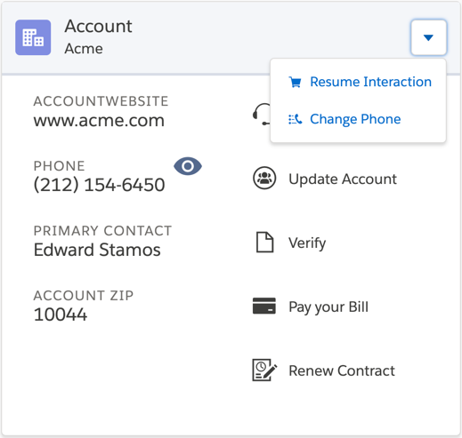
One-column container with each card's fields and actions displayed in a row |
 |
||
One-column container with each card's fields and actions displayed in a row in SLDS |
 |
||
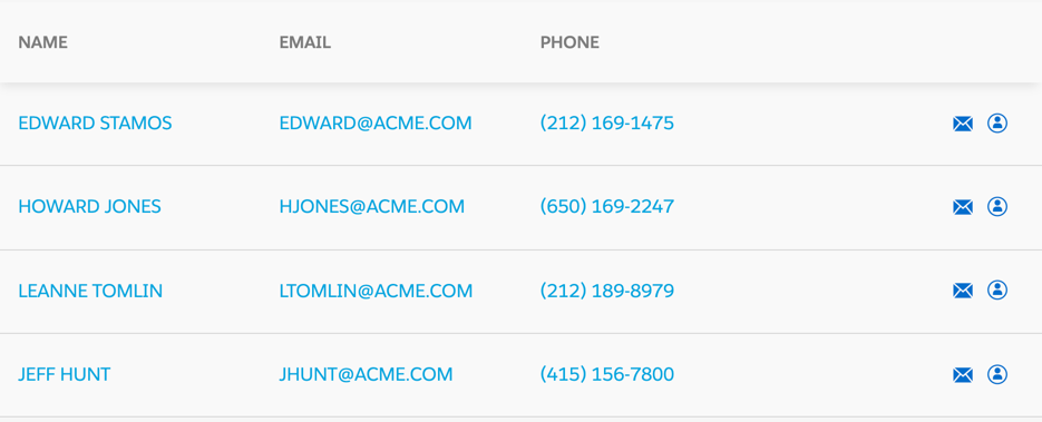
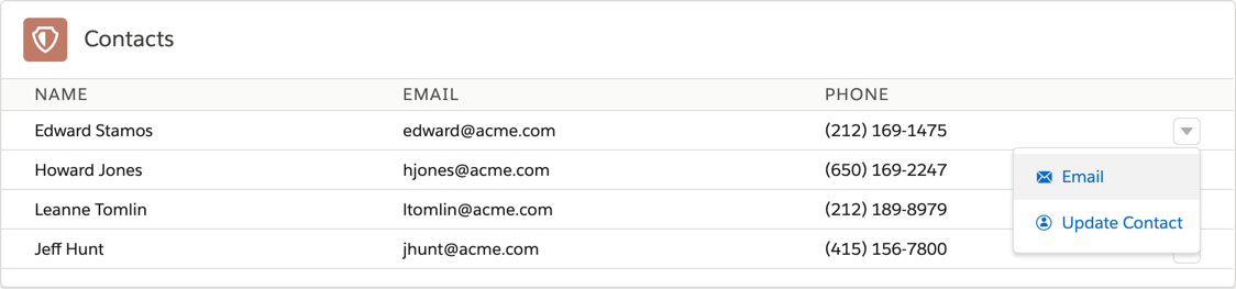
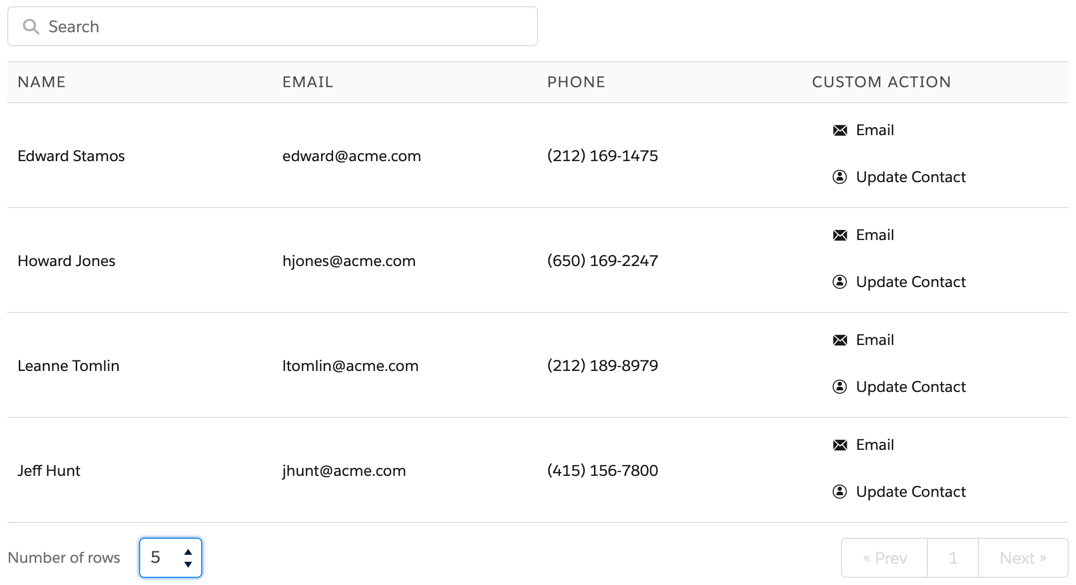
One-column container in a table. Each card's fields and actions are displayed in a row. Actions show in a vertical list. |
 |
Cards
To apply a Card Template:
-
In the Cards section of Vlocity Cards, ensure your Card isn’t active.
-
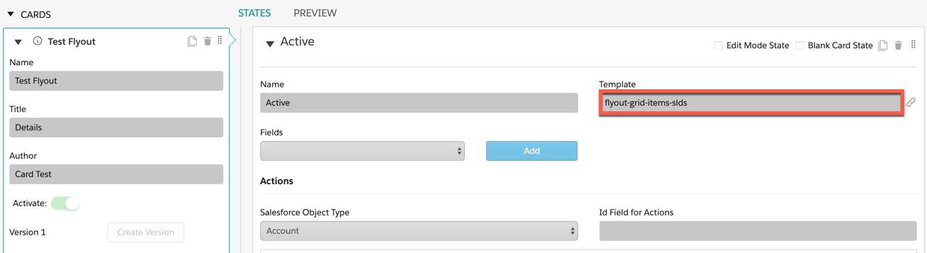
In the States section of Vlocity Cards, enter a Card template name into the Template field.
Card Template |
Description |
Template Preview |
Compatible Card Layout Templates |
|---|---|---|---|
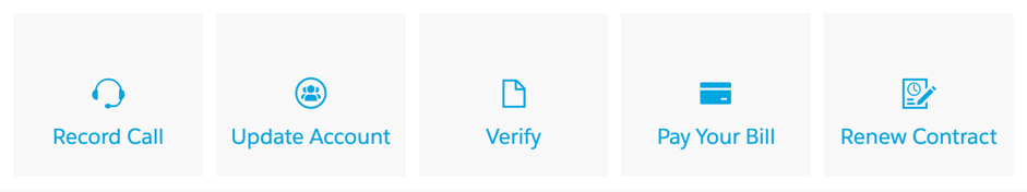
Displays actions (icon and label) in a responsive grid format |
 |
||
Displays actions (icon and label) in a responsive grid format using SLDS. |
 |
||
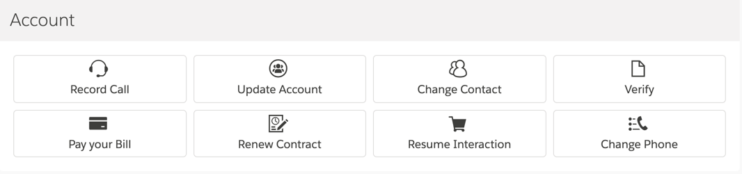
Displays a list of fields and an adjacent list of actions along with placeholder. |
 |
||
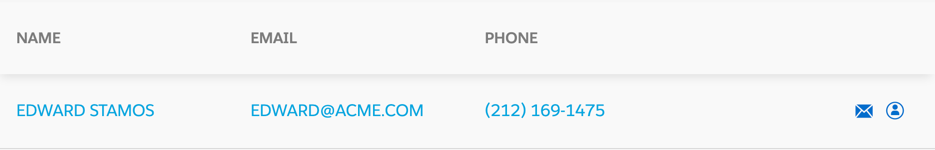
Displays a list of fields and an adjacent list of actions. |
 |
||
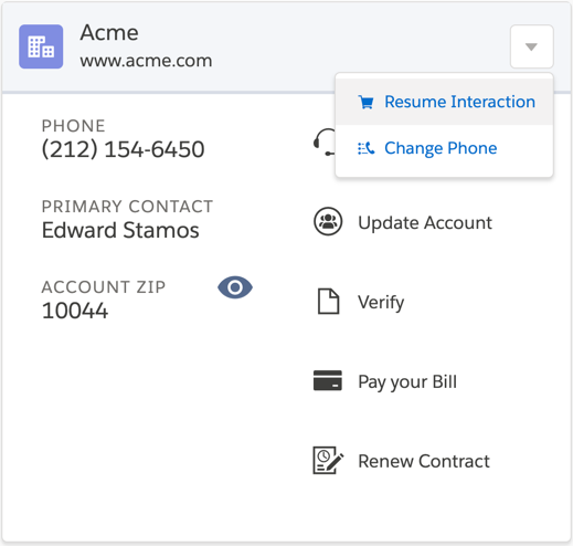
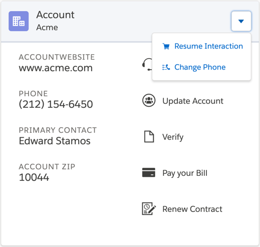
Displays a list of fields and an adjacent list of actions, using SLDS with tracking. For more information on tracking, |
 |
||
Displays entire card in single column with pagination, with four fields per page. |
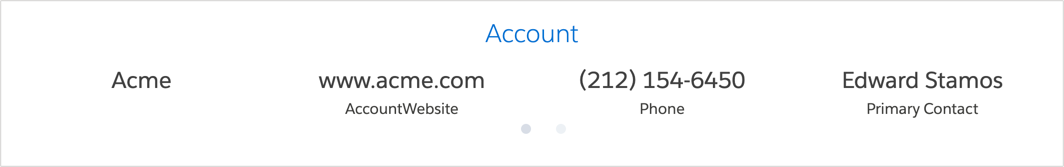 |
||
Displays entire card in single column with horizontal fields. Actions display horizontally under fields. |
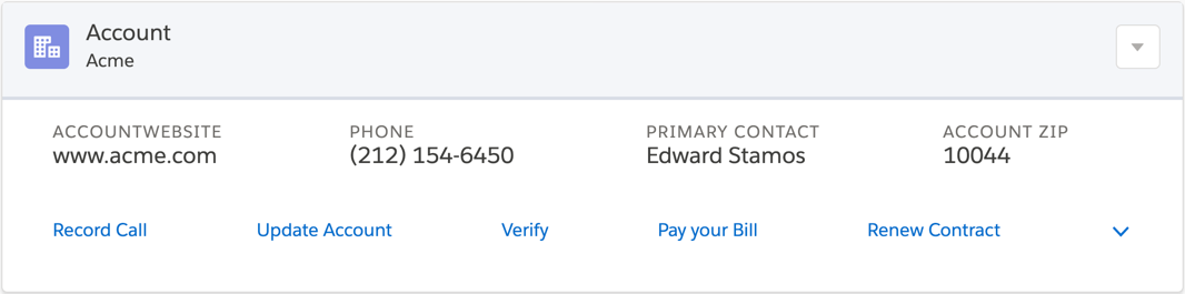 |
||
Displays entire card in single column with horizontal fields. Actions available only in dropdown. |
 |
||
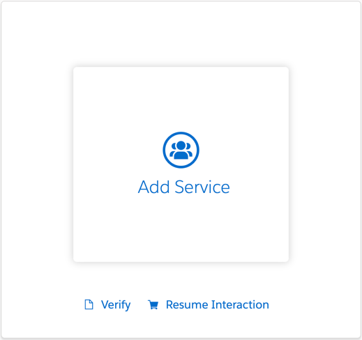
Displays entire card in single column with button and label. |
 |
||
Displays one button and label in SLDS. |
 |
||
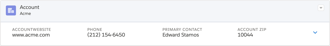
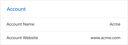
Displays list of field labels adjacent list of fields. |
 |
||
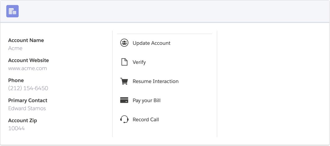
Displays entire card in a single column with a list of fields and an adjacent list of actions. In SLDS, includes placeholders, tracking and icon pattern. |
 |
||
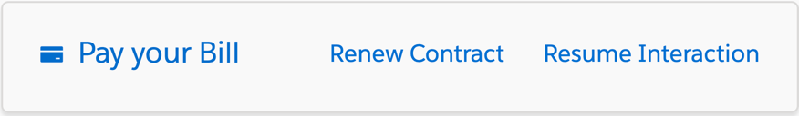
Displays fields in one row with all action icons listed on same row. |
 |
||
Displays fields in one row with all actions only available in dropdown. |
|
||
Displays fields in one row with all action icons and text listed in a vertical list. |
|
||
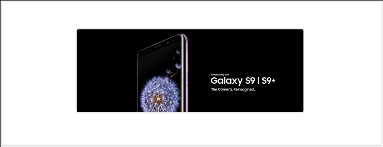
Displays image-only button. |
 |
Flyout Templates
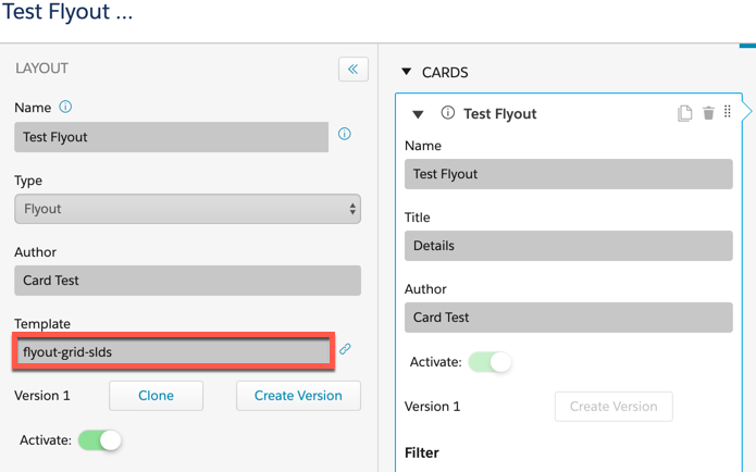
Flyout Templates enable users to view information or access additional actions for the current record or a child record. Similar to Cards, Flyouts are created in Vlocity Cards and use a Flyout Layout template to contain Flyout Card Templates. When active, the resulting Flyout becomes available in the Flyout Template dropdown.
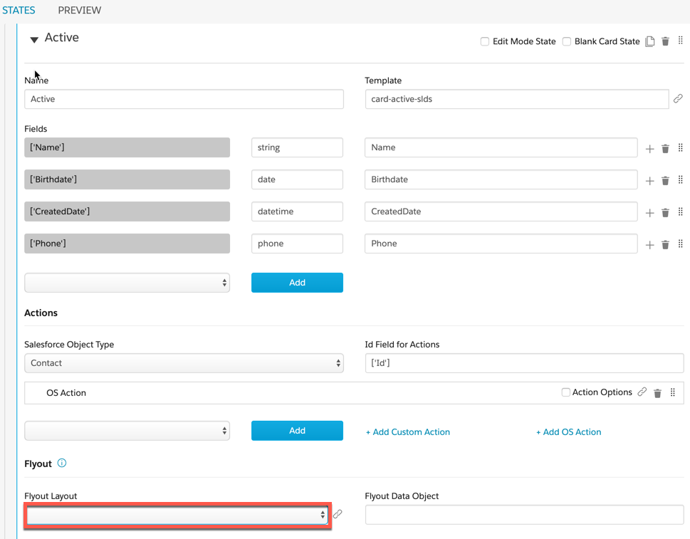
Flyout Layout Templates
Flyout Layout templates act as containers for Flyout Card Templates and control how the Flyout Card displays.
To apply a Flyout Layout Template:
-
In the Layout section of a Vlocity Card, ensure the Type is set to Flyout.
-
Enter a Flyout Template into the Template field.
Flyout Layout Template |
Description |
Template Preview |
Compatible Flyout Card Templates |
|---|---|---|---|
Simple one-column container for flyout components. |
 |
||
Three-column container for flyout components in SLDS. Overflow actions from parent card and flyout cards. |
 |
||
Two-column container for overflow actions from parent card. |
 |
||
One-column container for overflow actions from parent card. |
 |
||
Three-column container for flyout components in SLDS. No overflow actions from parent card. |
 |
Flyout Card Templates
To apply a Flyout Card Template:
-
In the Cards section of Vlocity Cards, ensure your Card isn’t active.
-
In the States section of Vlocity Cards, enter a Flyout Card template name into the Template field.
Flyout Card Template |
Description |
Preview |
Compatible Flyout Layout Templates |
|---|---|---|---|
Flyout container for card items. |
See Compatible Flyout Layout Templates |
||
Flyout container for card items in SLDS. |
See Compatible Flyout Layout Templates |
Console Card and Layout Templates
Console Card templates enable multiple records to be accessible and actionable all from the same view. In addition to Console Card and Layout Templates, there are out of the box Layouts that contain out of the box Cards. Console Cards also rely on embedded templates to display additional information all within one parent layout.

Out of the Box Console Layouts
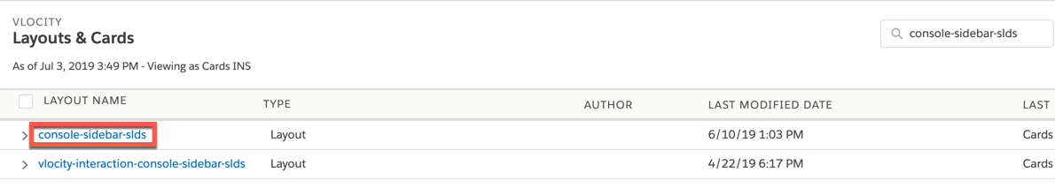
The Console Layouts are accessible in the Vlocity Cards landing page.
Layout |
Description |
Layout Preview |
Layout Template |
Cards |
Card Templates |
Embedded Templates |
|---|---|---|---|---|---|---|
Sidebar layout that displays left sidebar cards and the embedded story-card-canvas template. |
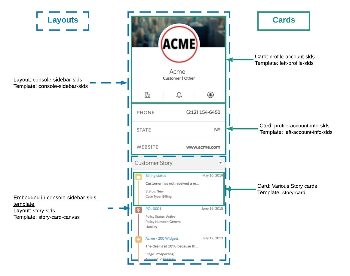 |
console-sidebar-slds |
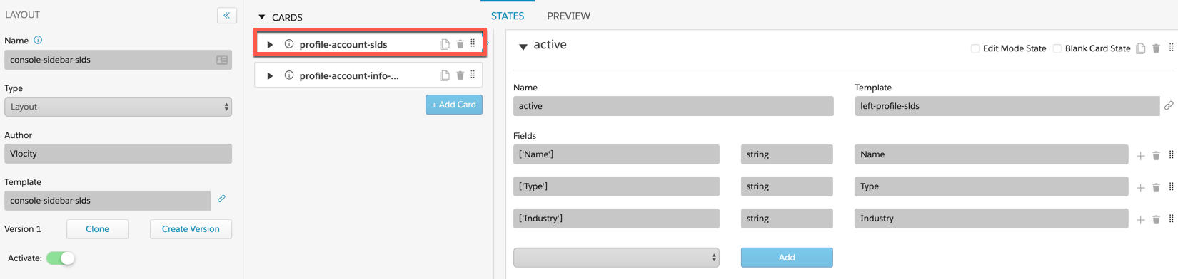
profile-account-slds profile-account-info-slds |
left-profile-slds left-account-info-slds |
story-card-canvas |
|
Layout for right sidebar cards. Displays offer cards based on Vlocity Intelligence inputs and profile cards. Cards for the left-profile-tag template are embedded in this template. |
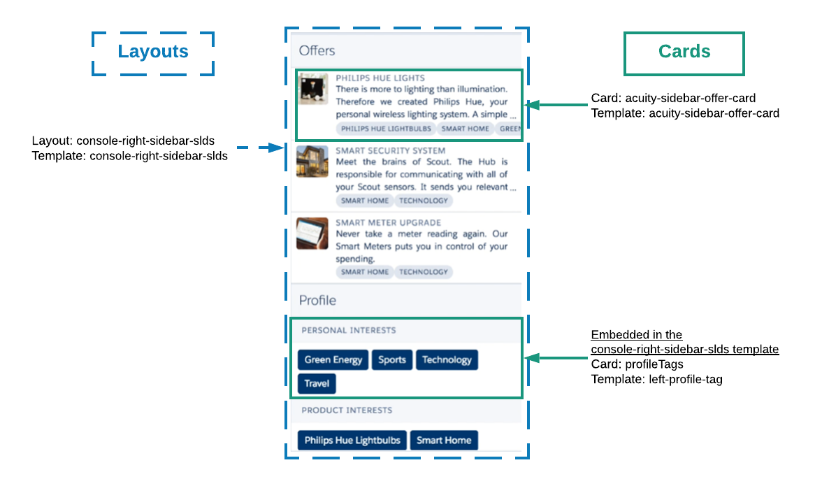 |
console-right-sidebar-slds |
acuity-sidebar-offer-card profileTags |
acuity-sidebar-offer-card |
left-profile-tag |
|
Embedded in the console-sidebar-slds template the story-slds layout presents story cards to the user and includes sorting by story type. |
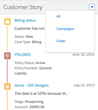 |
story-card-canvas |
Various Story Cards |
story-card |
n/a |
Out of the Box Console Cards
The Console Cards are accessible through the out of the box Console Layouts.
Card |
Description |
Card Preview |
Card Template |
Layout |
Layout Template |
|---|---|---|---|---|---|
Card that displays offer links in the console sidebar. |
 |
acuity-sidebar-offer-card |
console-right-sidebar-slds |
console-right-sidebar-slds |
|
Displays twitter photo, information, and actions in SLDS. |
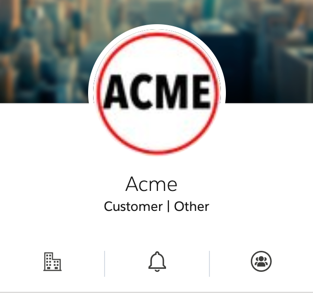 |
left-profile-slds |
console-sidebar-slds |
console-sidebar-slds |
|
Displays information for console sidebar in SLDS. |
 |
left-account-info-slds |
console-sidebar-slds |
console-sidebar-slds |
|
Displays the Profile component in the right sidebar. Profile tags are embedded in the console-right-sidebar-slds template. |
 |
left-profile-tag |
console-right-sidebar-slds |
console-right-sidebar-slds |