
You are here:
Configure an Edit Block (Managed Package)
For the managed package runtime, Edit Blocks enable a user to add and edit multiple entries in a single array. For example, you can use an Edit Block to list and edit an Account's list of Contacts. Edit Blocks are repeatable blocks by default. You can prefill repeatable blocks with data by using an array format.
 This information is for Omnistudio for Managed Packages. For Omnistudio on standard runtime, see Omnistudio Help.
Displaying Elements in an Edit Block
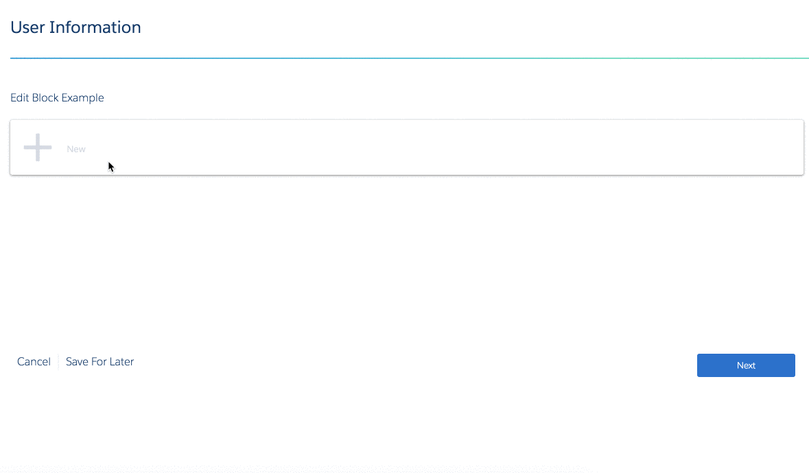
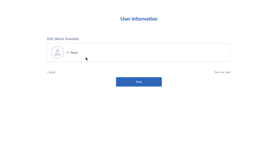
Edit Block displays three elements in the Edit Block's default view and can display additional elements in the edit view. It's possible to hide elements from the edit view.
-
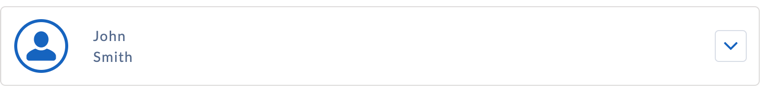
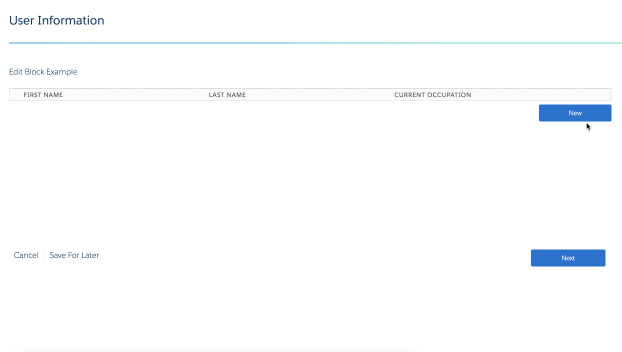
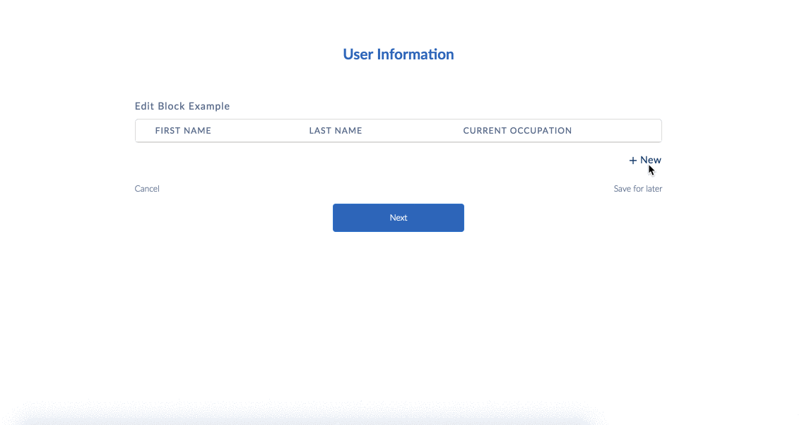
To display an element in the Edit Block's default view, check the checkbox next to the element in the structure panel. The element also appears when editing an entry.
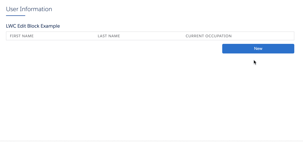
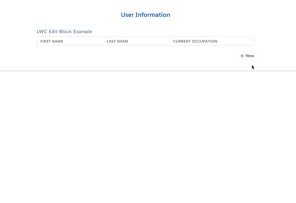
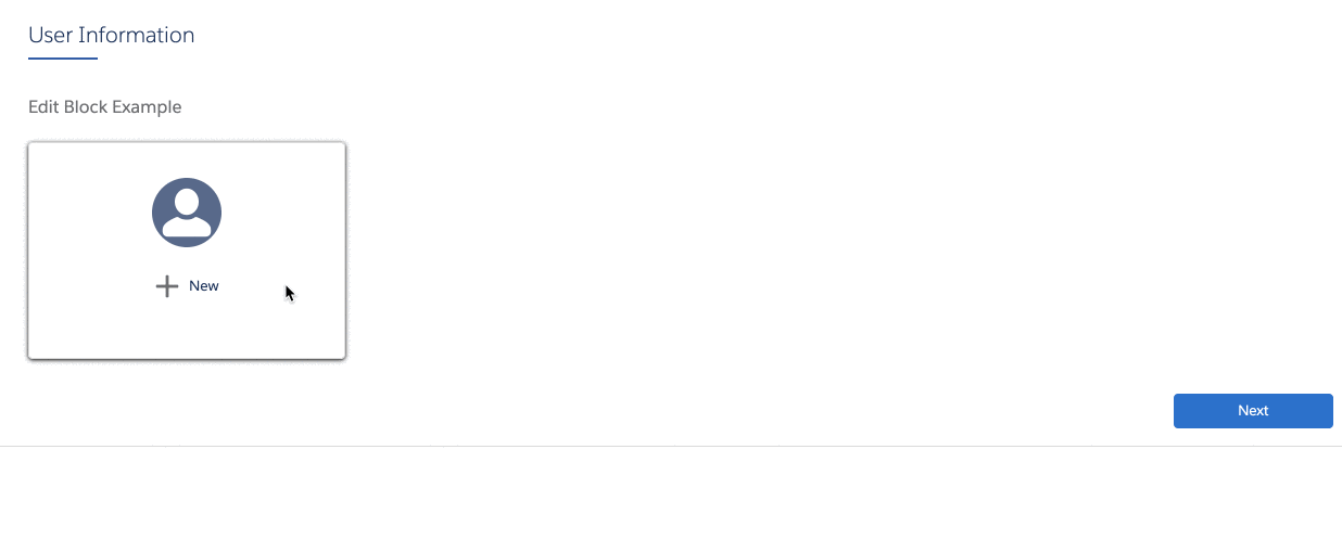
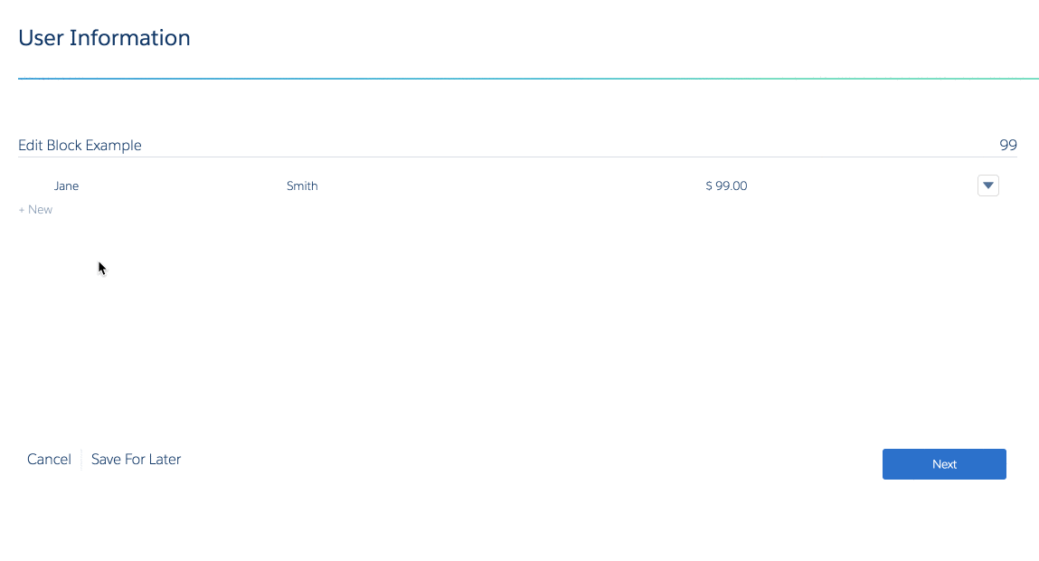
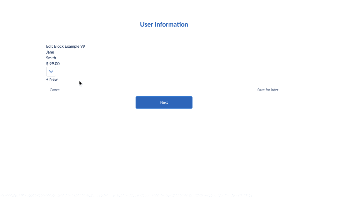
Example Default View:
-
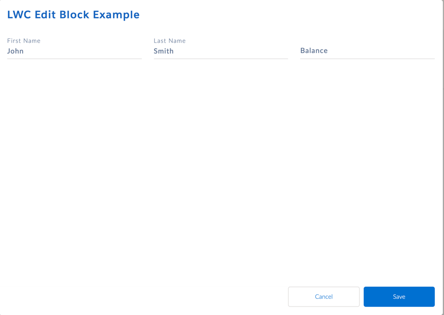
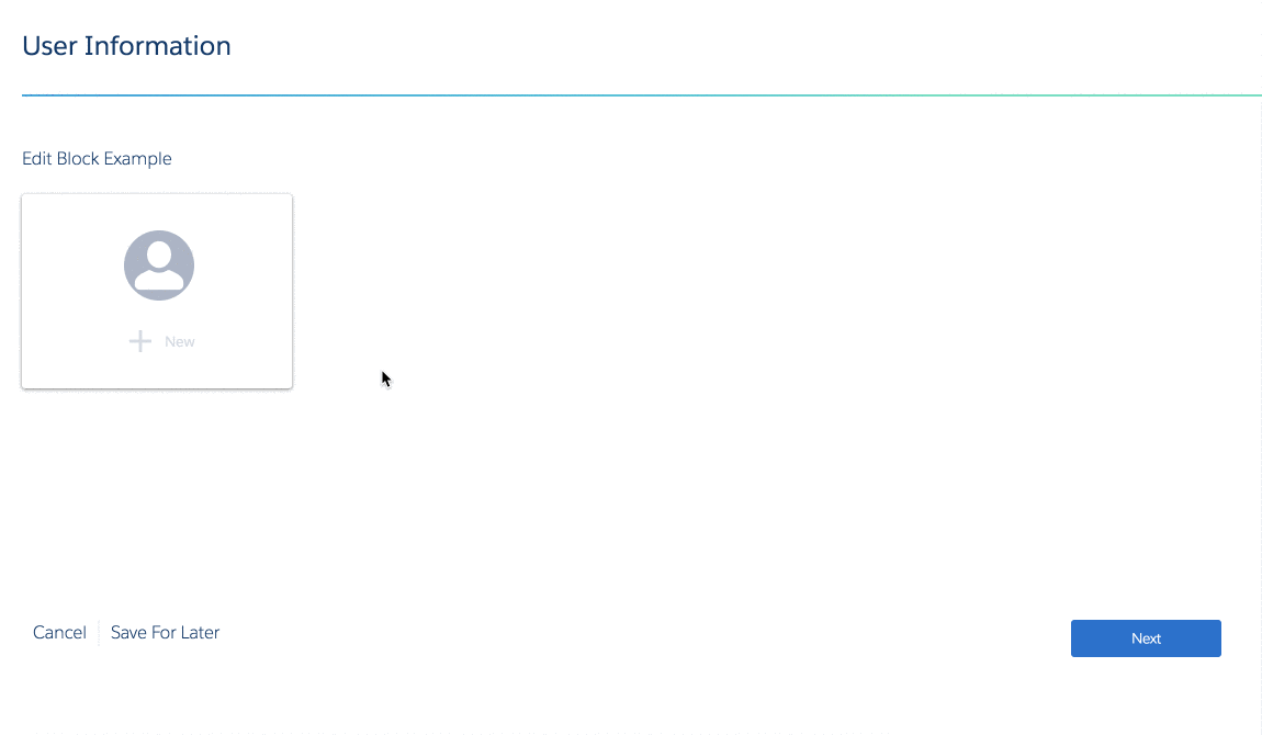
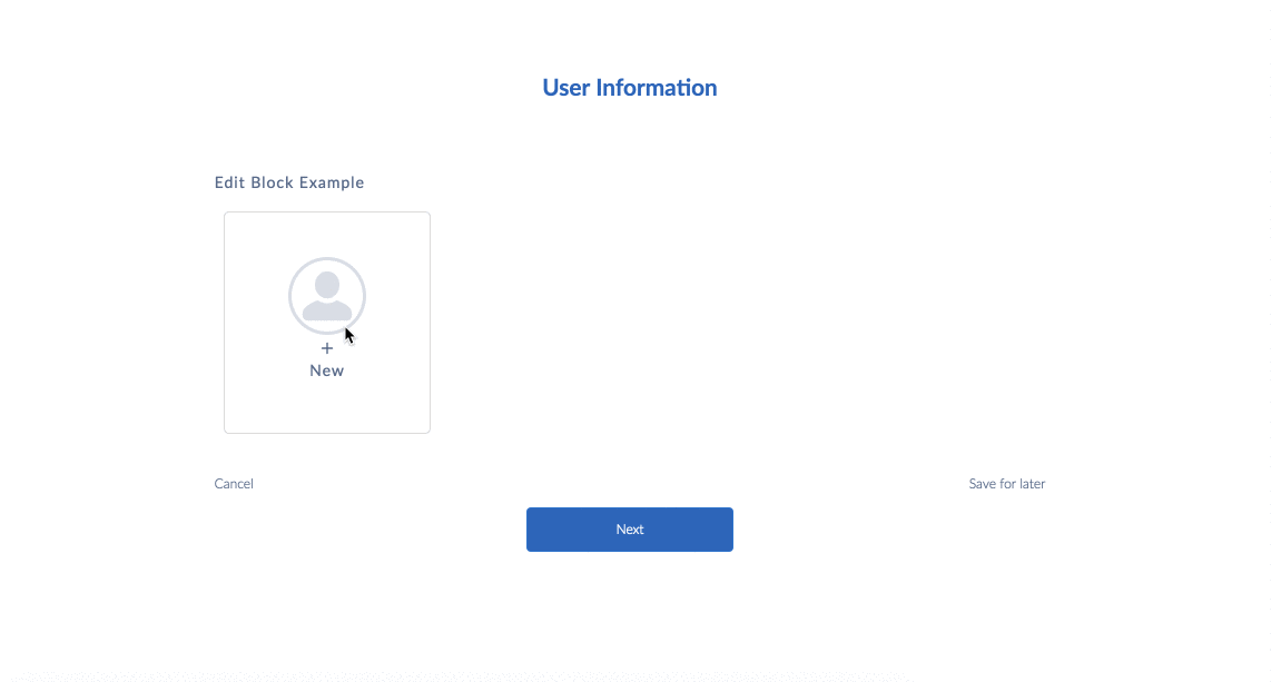
To display elements only when a user edits an entry, leave the checkbox next to the element in the structure panel unchecked.
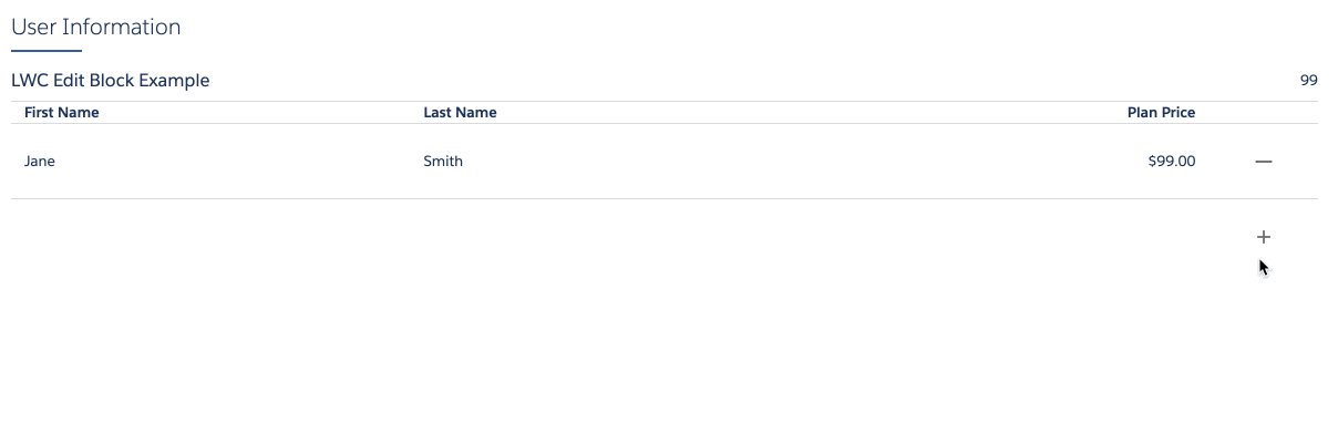
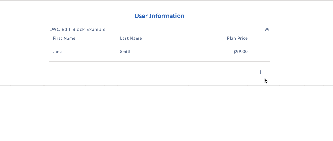
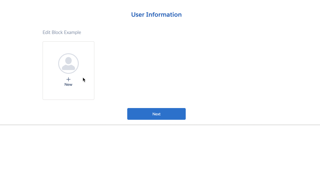
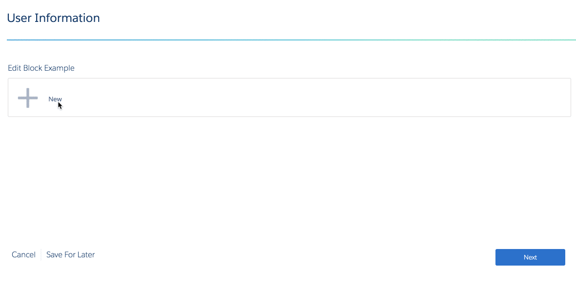
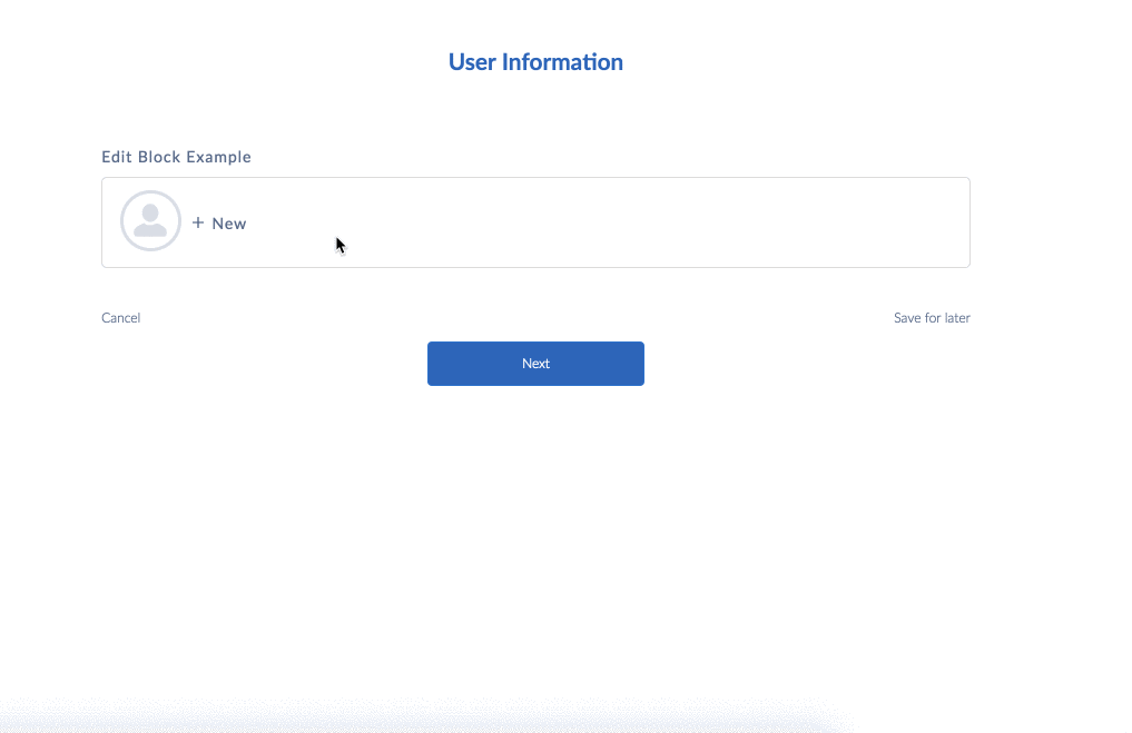
Example Edit View:
-
To hide an element in the Edit Block, click Edit as JSON in the element and set Hide equal to true. For more information, see Hide Omniscript Elements (Managed Package).
-
To display an element only in the Edit Block's default view, check the checkbox next to the element in the structure panel. Then click Edit as JSON in the element and set Hide equal to true. The element displays in the entry's default view and is hidden when editing the entry.
Setting Display Modes and Templates
Enable LWC Omniscripts and Angular Omniscripts to display different Edit Block user interfaces by using LWC Modes and Angular Templates.
LWC Modes
Select a Mode in the Edit Block's Edit Block Mode field to change the display and functionality of the Edit Block.
Mode |
Configuration Notes |
Lightning Example |
Newport Example |
|---|---|---|---|
Inline |
n/a |
 |
 |
Table |
The maximum number of elements that you can display as columns is 6. Currently, edit blocks configured in table mode in Omniscripts aren't compatible with screen readers. If you use a screen reader, we recommend that you use Flexcards instead of Omniscripts. In Flexcards, you can use data tables or Lightning datatables that are compatible with screen readers. See Show Data in a Table on a Flexcard and Lightning Web Component – Datatable. |
 |
 |
Financial Statement (FS) |
|
 |
 |
Cards |
n/a |
 |
 |
LongCards |
The width of LongCards must be set to 12. |
 |
 |
Angular Templates
Add a template to the EditBlock's HTML Template Id field to modify the display and functionality of the Edit Block.
Template Name |
Lightning Example |
Newport Example |
|---|---|---|
Responsive table - vlcEditBlock.html |
 |
 |
Cards - vlcEditBlockCards.html |
 |
 |
Financial Statement - vlcEditBlockFS.html |
 |
 |
Inline - vlcEditBlockInline.html |
 |
 |
Long cards - vlcEditBlockLongCards.html |
 |
 |
Compatible Elements
The following elements are compatible with Edit Block:
-
Aggregate
-
Checkbox
-
Currency
-
Date
-
Date/Time
-
Disclosure
-
Email
-
File
-
Formula
-
Headline
-
HTTP Action
-
Image
-
Integration Procedure Action
-
Line Break
-
Lookup
-
Matrix Action
-
Multi-select
-
Number
-
Password
-
Radio
-
Radio Group
-
Range
-
Remote Action
-
Select
-
Signature
-
Telephone
-
Text
-
Text Area
-
Text Block
-
Type Ahead Block
-
Time
-
URL
What's Next
Add actions to an Edit Block or use sObject mapping to create, edit, and delete records. See Add, Edit, and Delete Records with Edit Block Actions (Managed Package).