
You are here:
Create Responsive Elements on a Flexcard (Managed Package)
For the managed package runtime, enable an element's width to change when the viewport updates. For example, make the widths of the fields for First Name and Last Name of a Contact take the full width of the page on smaller devices, but shrink to 50% on larger devices such as laptops and desktops.
 This information is for Omnistudio for Managed Packages. For Omnistudio on standard runtime, see Omnistudio Help.
By default, the width of an element is the same no matter the width of the viewport of the device your user views the Flexcard. When responsiveness is enabled, the width of an element changes to the width set at each viewport breakpoint. The default width becomes the width on the smallest viewport breakpoint for a mobile-first approach. See Flexcards Element Responsiveness (Managed Package).
Build with a mobile-first approach if most or all of your elements are responsive. Build your Flexcard at the smallest canvas size by selecting Mobile L/S from the Viewport Dropdown. After setting widths for all breakpoints for each element from the Style panel, view your layout at different viewports by toggling through the Viewport Dropdown. See View a Flexcard at Different Viewport Breakpoints (Managed Package)

- In the Flexcard Designer, click an element on the canvas, and click Style to open the Style panel.
-
From the Dimensions section, enable Responsive.
 Note
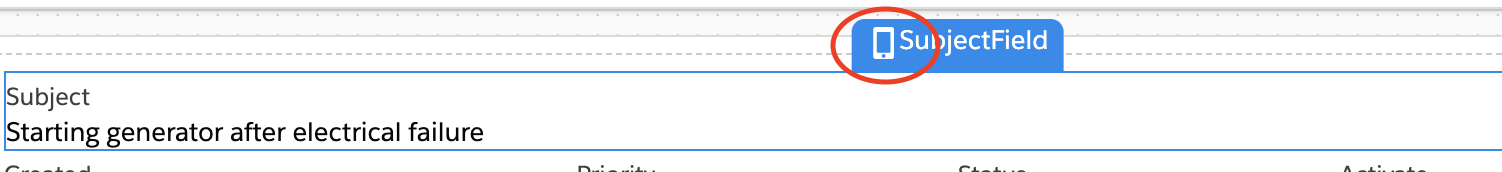
NoteEasily identify responsive elements by selecting or hovering over the element. A device icon displays next to the Component Name.
- For each viewport breakpoint, adjust the slider to set a width.
- To test the responsiveness of your elements, toggle between viewport widths from the Viewport Dropdown. See View a Flexcard at Different Viewport Breakpoints (Managed Package).


What’s next: Preview your Flexcard. See Preview a Flexcard (Managed Package).