
You are here:
Display Records Side-By-Side on a Flexcard (Managed Package)
For the managed package runtime, display records side-by-side instead of stacked on top of each other by embedding a child Flexcard and adjusting the widths of its states. By default, records display one on top of the other regardless of the widths of individual elements in the Flexcard.
 This information is for Omnistudio for Managed Packages. For Omnistudio on standard runtime, see Omnistudio Help.
To display records next to each other, embed a Child Flexcard whose width is at most 6 columns (50%) wide. See Adjust the Width of an Element on a Flexcard (Managed Package).
-
To create and configure the child Flexcard, perform the following tasks:
-
In the Flexcards home tab, click on a child Flexcard to open the Designer. Or, create a child Flexcard and add all the elements you want to display on each state. See Embed Flexcard Inside Another Flexcard (Managed Package)
-
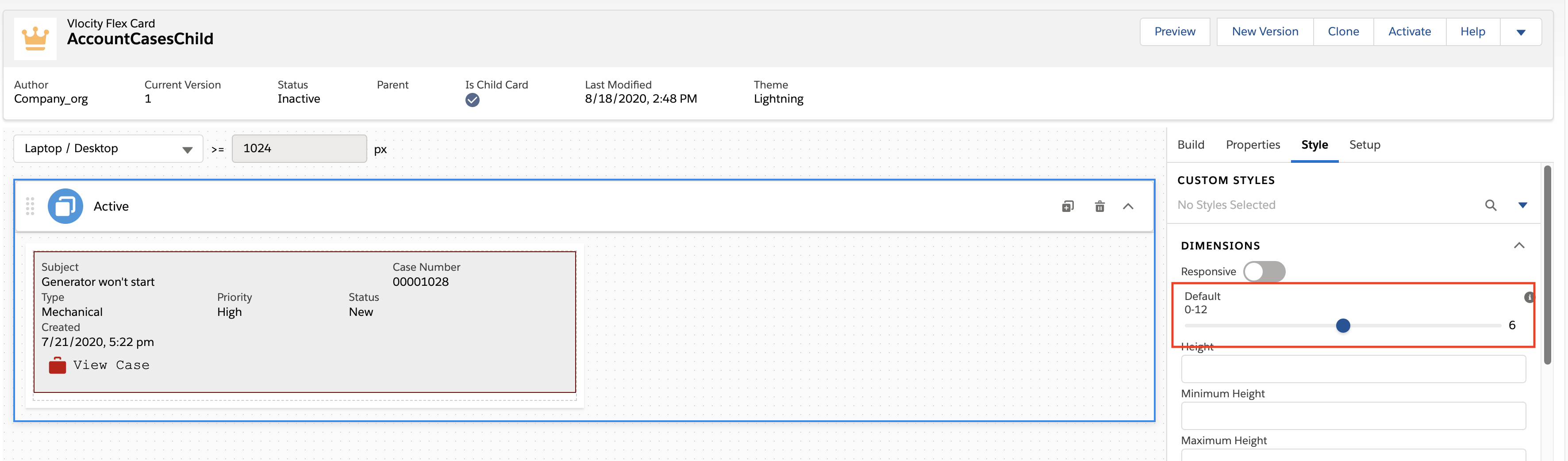
Click a state, and click Style to open the Style panel.
-
From the Dimensions section, under Default, use the slider to adjust the width of the state to at most 6.
For example, to display two records next to each other, select 6. To display 3 records next to each other, select 4. To display 4 records next to each other, select 3.
 Tip
TipConsider enabling responsiveness so that when your Flexcard is viewed on mobile devices, your content looks good. For example, make the records full width when on mobile devices, but 6 columns wide on tablets, and 3 columns wide on desktops. See Create Responsive Elements on a Flexcard (Managed Package).
-
Repeat steps 2 and 3 for each state on your child Flexcard.
-
Click Activate.
-
-
To embed the child Flexcard inside a Flexcard, perform the following tasks:
-
Open an existing Flexcard from the Flexcards home tab. Or, create a new parent Flexcard. See Create a Flexcard (Managed Package).
-
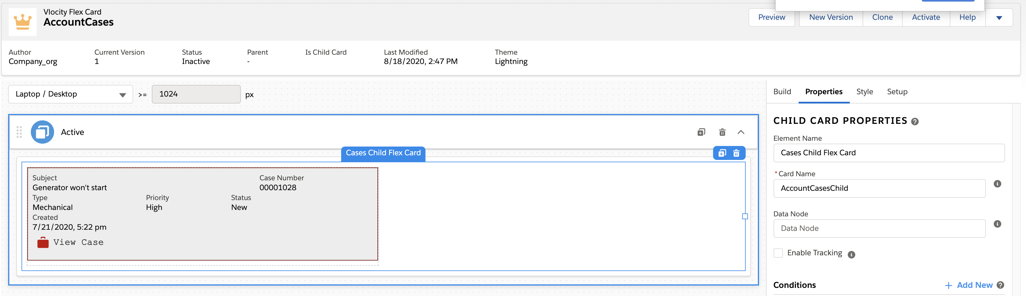
From the Build panel, drag a Flexcard element into an active state.
-
Click into Card Name and select the name of the child Flexcard you created in the previous steps.
-
If your parent data doesn't need to be looped over, click Setup, and deselect Repeat Records. Only one record is displayed in the parent Flexcard. See Disable Record Looping on a Flexcard (Managed Package).
Deselect Repeat Records only to make a Chart or Datatable display one record. For all other elements, Repeat Records is required for displaying even one record.
-
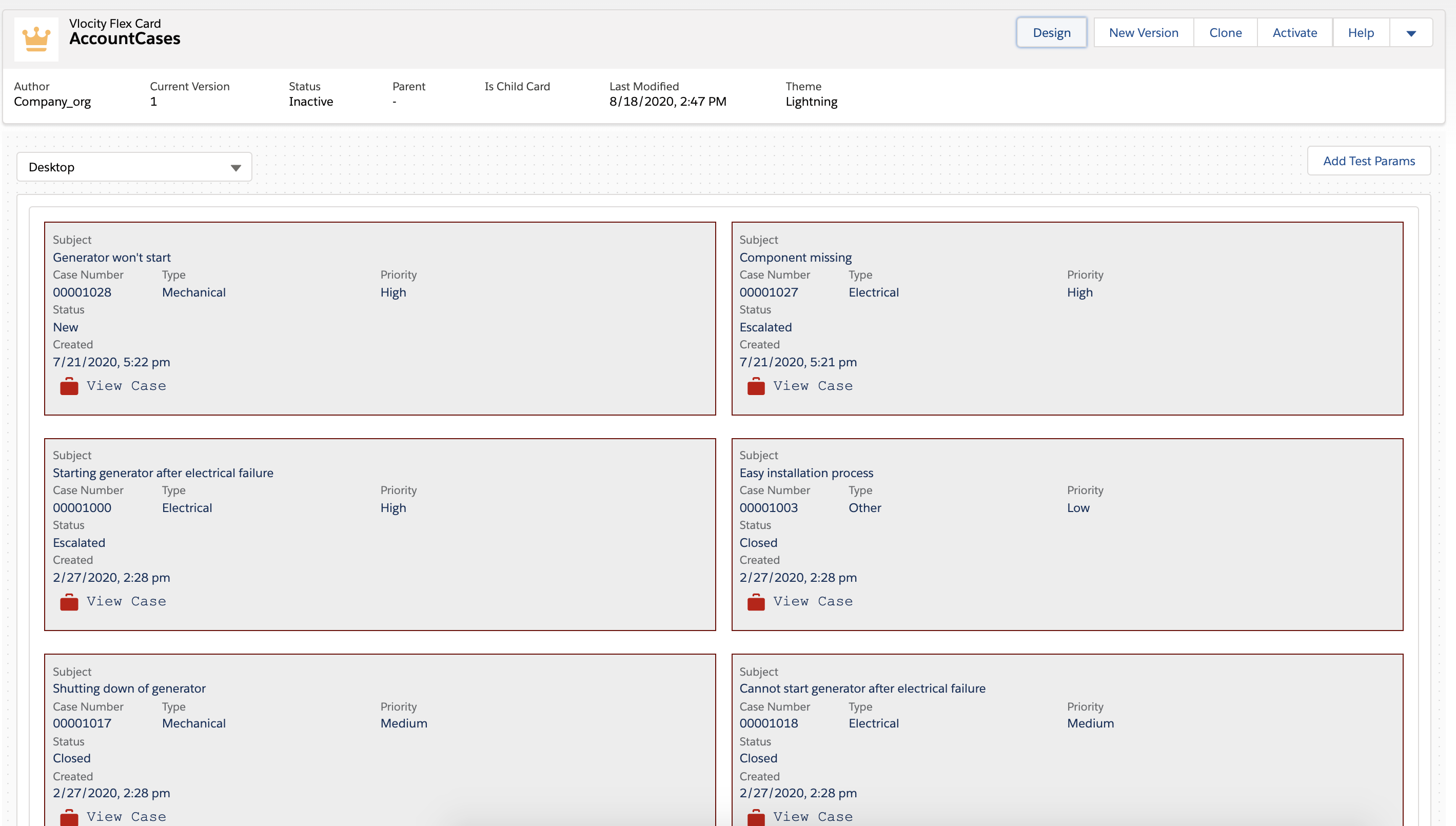
Click Preview to see your records displayed next to each other.
-
Click Activate.
-