
You are here:
Flexcard Designer (Managed Package)
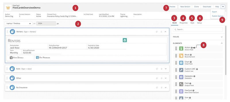
For the managed package runtime, the Flexcard Designer is a declarative tool with a drag interface and WYSIWYG editing that makes it easy to build user interface (UI) Lightning web components without code. Build interfaces rich in information and with actions relevant to your customer's context. You can also create the look and feel of your Flexcard by styling individual elements from graphic user interfaces (GUIs) built into the designer.
 This information is for Omnistudio for Managed Packages. For Omnistudio on standard runtime, see Omnistudio Help.
Required Versions |
|---|
Available beginning with Vlocity Insurance and Health Summer '20. |
Flexcard Designer Highlights
With the Flexcard Designer, you can:
-
Build your Flexcard on a wide and adjustable Canvas.
-
Drag customizable elements from the Build panel onto the Canvas.
-
Adjust the width of any element along a 12-column horizontal grid.
-
Use the Action element to launch an Omniscript or Flyout, and trigger Custom or Pubsub Events, and more.
-
From the Style panel, customize the look and feel of your Flexcard. Style elements using a GUI to choose the colors of texts, borders, and backgrounds, change the size of fonts and entire elements, and make elements responsive.
-
Create a new Flexcard and configure your data source with a step-through wizard.
-
Use In-Product Help to learn about a property or an element without leaving the Designer.
-
Configure Flexcard-wide settings from the Setup panel, such as required permissions, event listeners, session variables, and more.
-
Configure metadata values for your generated LWC and update its component SVG icon with the Publish Options feature.
-
Download on and off-platform Flexcard LWCs.
-
Debug your Flexcard by viewing its data JSON and the response and request logs for its actions and events.
-
Run Flexcards outside of Salesforce with OmniOut for Flexcards.
What’s Next
Explore the Flexcard Designer. See Get to Know the Flexcard Designer (Managed Package).
- Get to Know the Flexcard Designer (Managed Package)
For the managed package runtime, get to know how the different parts of the Flexcard Designer work to build rich interfaces relevant to your customer's context. - Build a Flexcard with the Flexcard Designer (Managed Package)
For the managed package runtime, with the Flexcard Designer create, build, design, test, and activate a Flexcard before publishing it to a Lightning or Experience page. Use a drag interface with WYSIWYG editing to preview while you build dynamic context-specific user interfaces for customer interactions.
