
You are here:
Flexcard Toggle Element Type Reference (Managed Package)
For the managed package runtime, select how to trigger an action when a user clicks a Toggle element on a Flexcard. Enable a user to pick between two states, enable or disable an option, or select multiple options to trigger an action.
 This information is for Omnistudio for Managed Packages. For Omnistudio on standard runtime, see Omnistudio Help.
Toggle Type |
Description |
Example |
|---|---|---|
Checkbox Button |
Displays a checkbox styled as an icon that enables switching between two options, where each state can display a unique icon. Configurable options include adding a visible label next to the element. |
 |
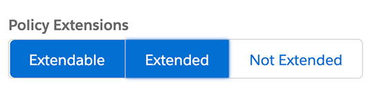
Checkbox Group Button |
Displays a group of checkboxes styled as clickable textual buttons. |
 |
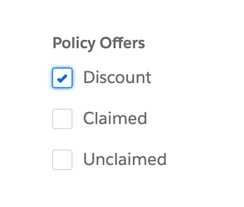
Checkbox Group |
Displays a group of checkboxes with labels. |
 |
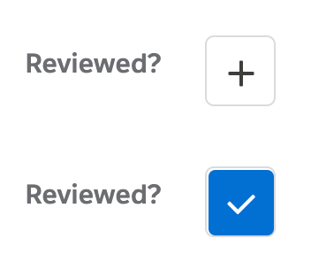
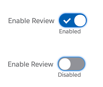
Checkbox Toggle |
Displays a checkbox styled as an on/off switch that enables switching between disabled and enabled. Configurable options include displaying labels for each state. |
 |
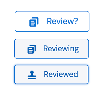
Dual Stateful Button |
Displays an icon button that enables switching between two options. Each state can display a unique icon. |
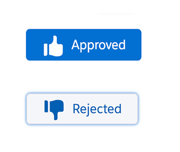 |
Stateful Button |
Displays an icon button that enables switching between selected and unselected options when clicked, and a hover state on focus. Configurable options include adding a label and unique icons for all three states, and adding a style variant, such as Brand. |
 |
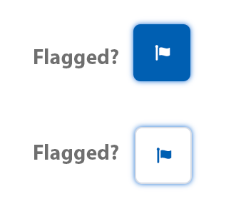
Stateful Icon |
Displays an icon button that enables switching between two options. The same icon displays for both states. |
 |