
You are here:
Get to Know the Flexcard Designer (Managed Package)
For the managed package runtime, get to know how the different parts of the Flexcard Designer work to build rich interfaces relevant to your customer's context.
 This information is for Omnistudio for Managed Packages. For Omnistudio on standard runtime, see Omnistudio Help.
The Flexcard Designer is a declarative tool with a drag interface and WYSIWYG editing that makes it easy to build user interface (UI) Lightning web components without code.
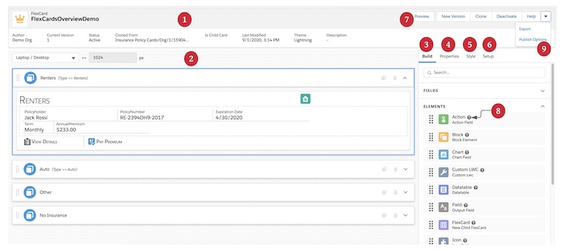
Header (1)
In the Header, view basic metadata about your Flexcard such as Author, Namespace (beginning Spring '22), Current Version, and Status.
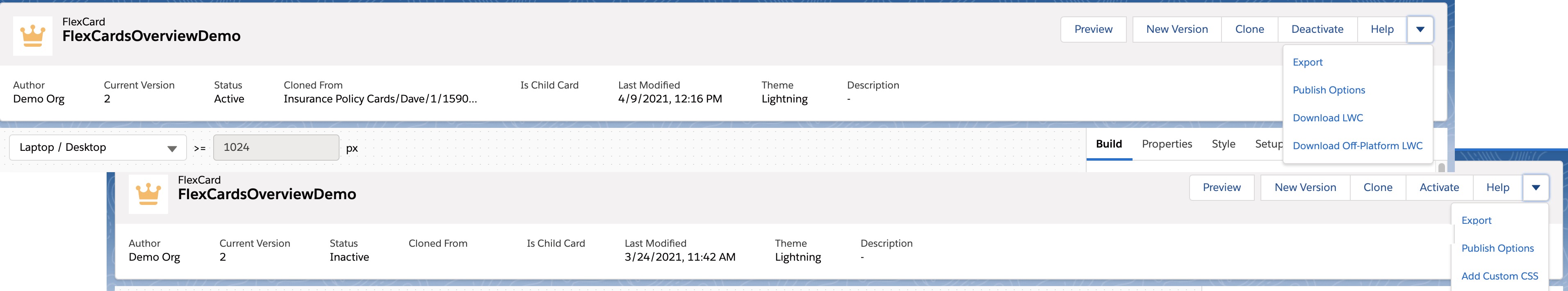
Perform actions related to your Flexcard, such as Preview, Clone, Activate, Export, Add Custom CSS, create a New Version, and access a list of resources from a Help link. When the Flexcard is active, Deactivate, and configure Publish Options. Also, download a version of the Flexcard to use on-platform (within in Salesforce) and off-platform (outside of Salesforce).
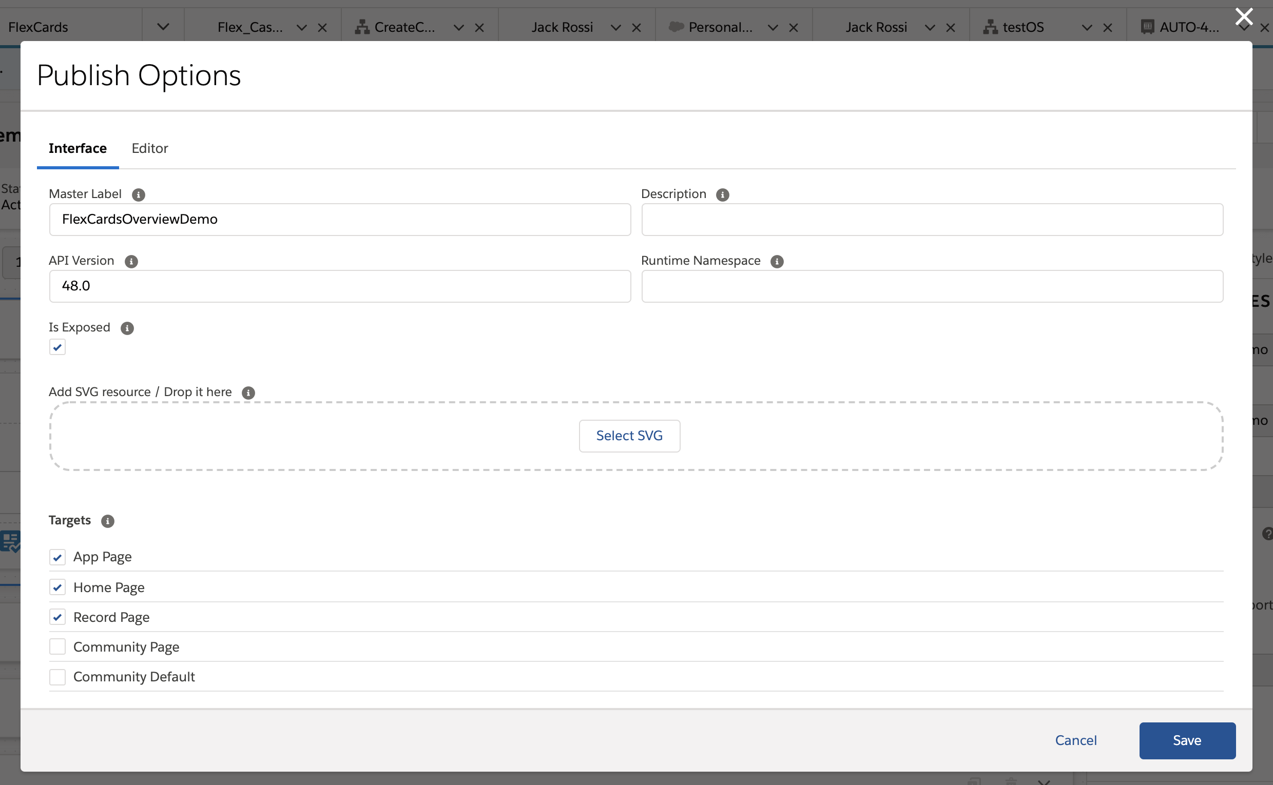
Publish Options (9) enables you to configure your generated Flexcard LWC's metadata values, such as where the component can be published, API version, description, and more. Also add your own custom component SVG icon to identify your generated LWC in the Experience Builder for Communities and Lightning App Builder for Lightning pages.
Canvas (2)
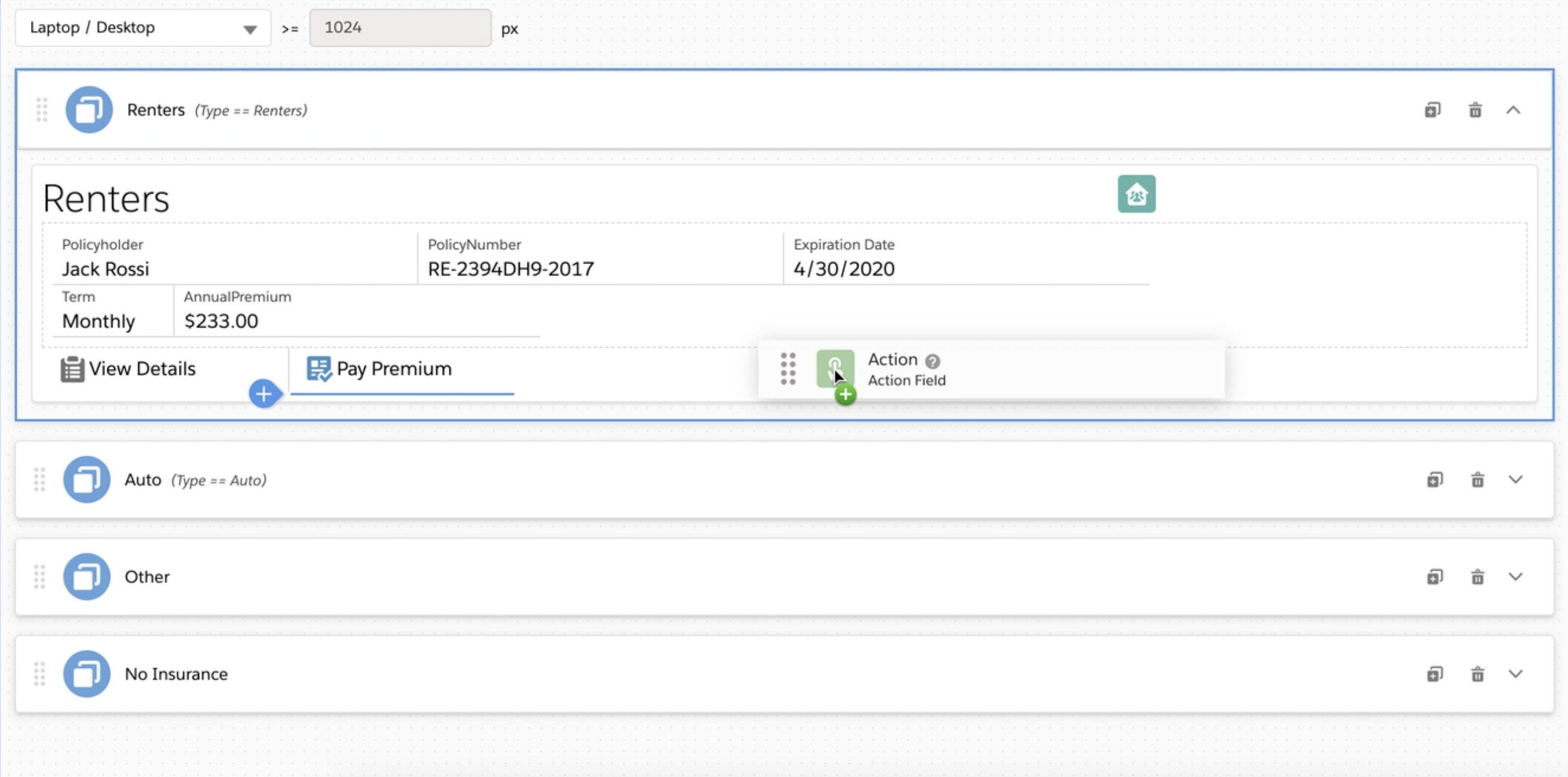
Build your card by dragging elements from the Build panel into a state on the Canvas. Rearrange, clone, delete, and adjust the widths of your elements as needed.
Test the responsiveness of your Flexcard with the Viewport Dropdown.
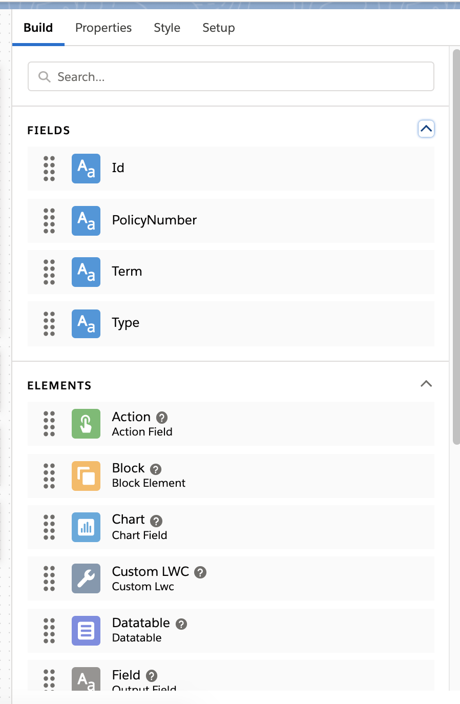
Build Panel (3)
Drag elements from the Build panel onto the Canvas to build the layout of your Flexcard. Drag all available fields from a configured data source from the Fields list into a State. You can also add states to your Flexcard, and embed Custom LWCs and reusable child Flexcards.
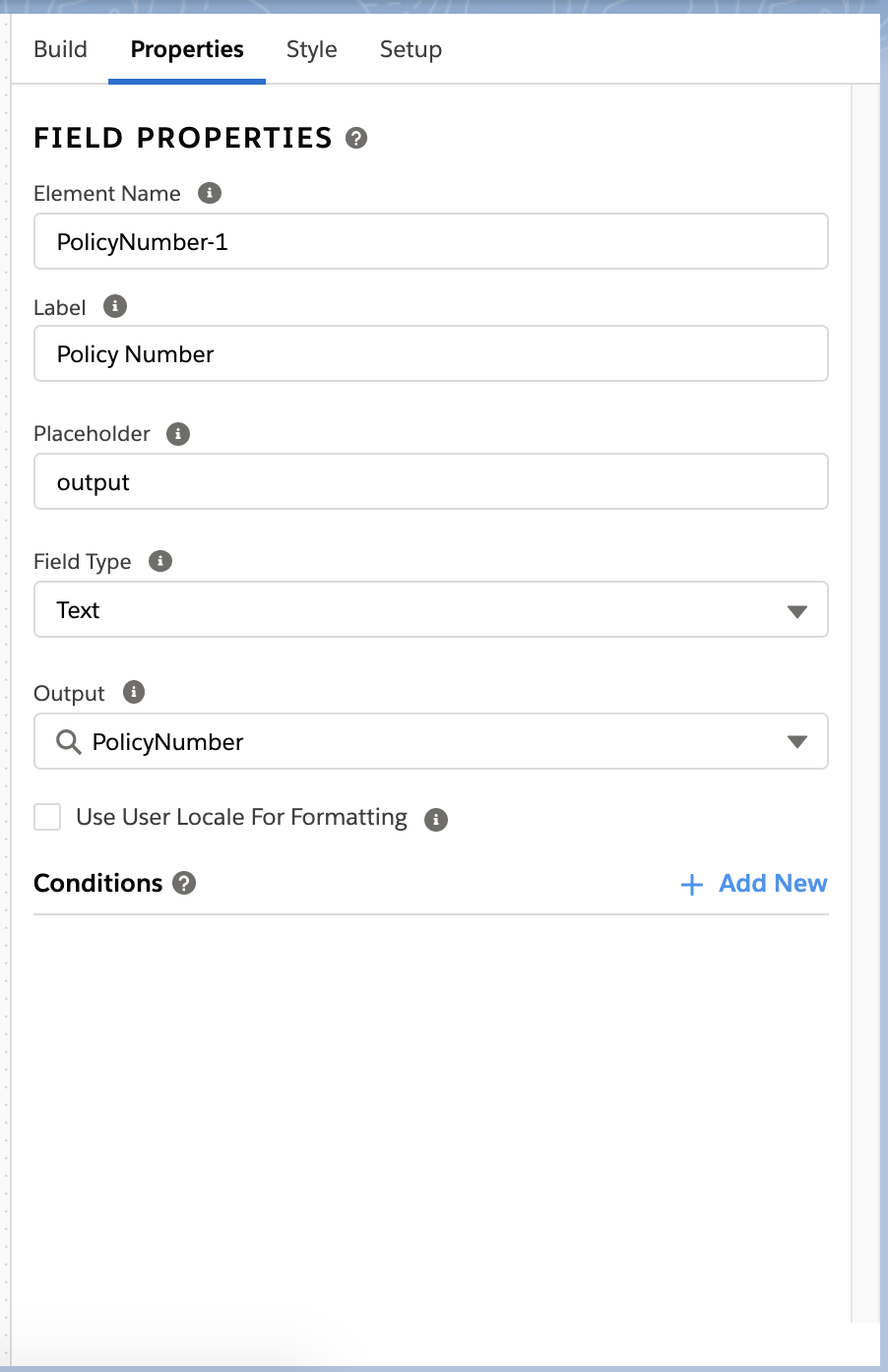
Properties Panel (4)
Configure element properties from the Properties panel when an element is selected on the Canvas. For example, when a Field element is selected, you can update the Label, choose the data field value to display, select the type of field it is, and more.
Style Panel (5)
Style your Flexcard elements from the Style panel using a GUI that updates the look of elements in real-time. Configure backgrounds, sizes, borders, padding, margins, height, fonts, and responsiveness.
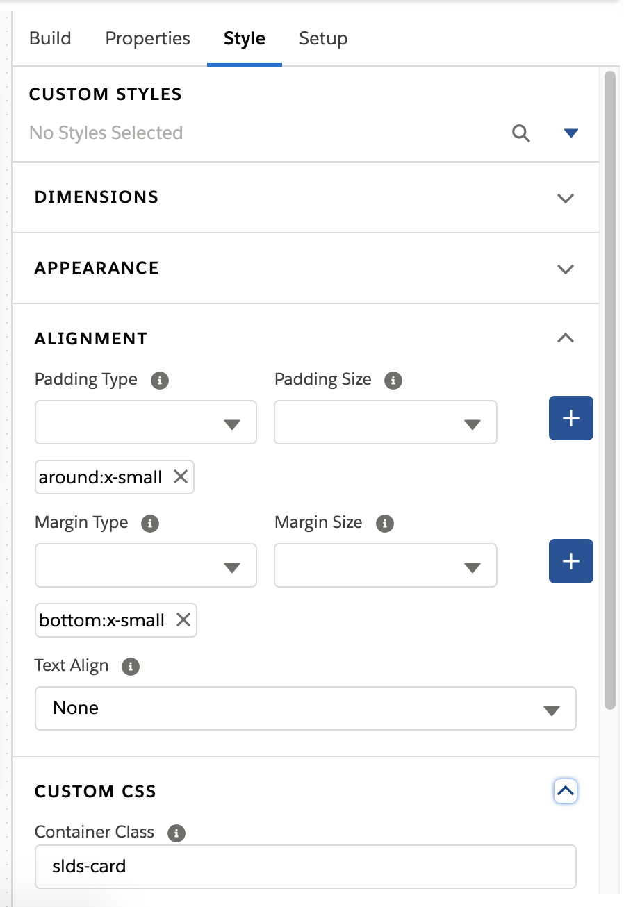
For custom design needs, create and apply custom CSS. Create CSS classes with an in-product code editor with Intellisense features such as code completion, contextual prompts, and a color picker. Apply custom classes created from the editor or from any style sheet accessible to the Flexcard, or apply inline CSS styles.
Save style settings on an element to use on multiple elements on the Flexcard.
Add conditional styles based on the value of a data field.
Setup Panel (6)
Configure global options from the Setup panel.
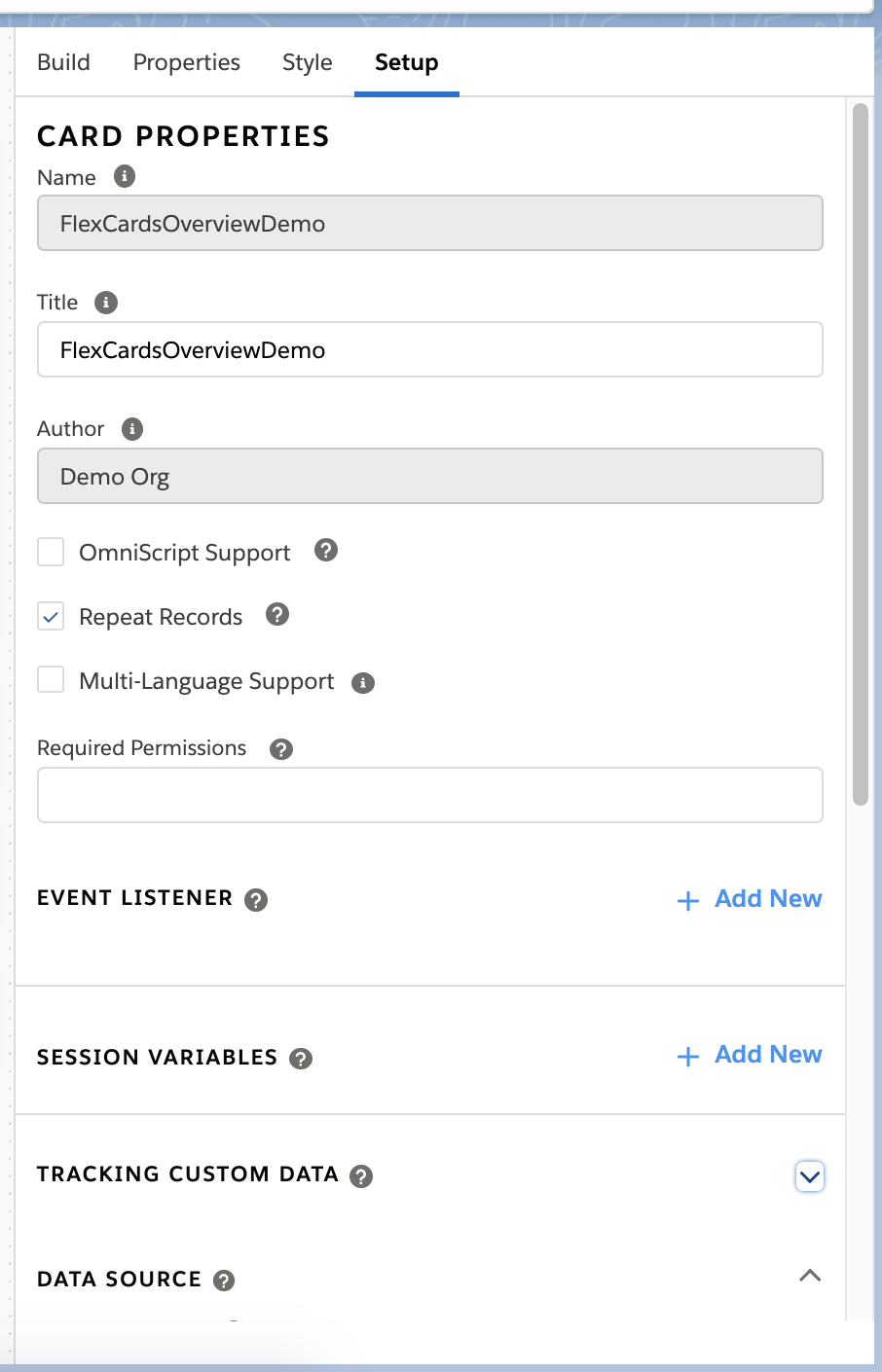
Update your data source. Apply custom permissions to limit access to your Flexcard. Track Custom Data on elements with tracking enabled.
Enable Multi-Language and Omniscript Support, set Session Variables, create Event Listeners, and configure Repeat Options.
Preview (7)
(A) Preview your Flexcard in real-time to test its design and functionality.
(B) Preview how a Flexcard appears on different devices, such as mobile, desktop, and tablet with the Viewport Dropdown.
(C) Add Test Parameters to preview your Flexcard with different parameters, such as record Ids, and pagination limits.
(D) Debug your Flexcard. View your Flexcard's data JSON with the Data JSON panel. Debug action and event requests and responses with the Action Debugger.
In-Product Help (8)
Find context-sensitive help specific to an element or property using the Flexcard Designer's in-product help feature.
(A) Access in-line information about specific properties by hovering over tooltip icons.
(B) View detailed documentation about an element's or feature's purpose and functionality with slide-out help trays.
What’s Next
Get started building Flexcards with the Flexcard Designer. See Get Started with Flexcards (Managed Package). Then, Create a Flexcard (Managed Package).