Bubble charts use the size and coloring of bubbles to show multiple dimensions and
measures. Use a bubble chart to illustrate the relationship between two columns of numerical data
in your spreadsheet. A third numerical column represents the size of each bubble in the
chart.
Required Editions
Available in: Quip desktop app, Quip iOS mobile app, and Quip
on web
Data Options for Bubble Charts
To adjust the data in bubble charts, open the Chart Editor.
To see and adjust how the data is treated, use the Data tab. In addition to the standard
options, there are several more settings for bubble charts.
Y-Axis: Specify the cell range for the chart’s Y-axis.
Sizes: Specify the cell range for the sizes of the bubbles in the chart.
To adjust the appearance of bubble charts, use the Customize tab.
Style: Change the position of the chart legend, or hide it entirely. Select the colors for
the chart’s background and border.
Horizontal Axis: Give the axis a title, adjust its scale, set the number of tick marks
shown, change the number formatting, and reverse the axis order.
Vertical Axis: Give the axis a title, adjust its scale, set the number of tick marks shown,
and change the number formatting
Sample Data for Bubble Charts
To create a sample bubble chart, copy the
sample data, and paste it into a Quip spreadsheet. Select the data range, and then from the
Insert menu, select Chart | Bubble. To adjust how the data appears, double-click the chart to open the Chart Editor,
and then deselect Switch rows and columns.
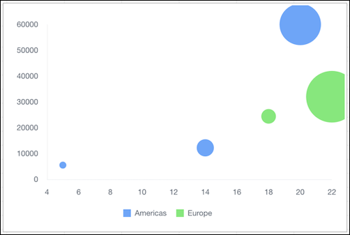
Country
Sales Reps
Sales
Region
Market Size
USA
5
$5,500
Americas
3%
Brazil
14
$12,200
Americas
12%
Mexico
20
$60,000
Americas
33%
Italy
18
$24,400
Europe
10%
France
22
$32,000
Europe
42%
Did this article solve your issue?
Let us know so we can improve!
Loading
Salesforce Help | Article
Cookie Consent Manager
General Information
Required Cookies
Functional Cookies
Advertising Cookies
General Information
We use three kinds of cookies on our websites: required, functional, and advertising. You can choose whether functional and advertising cookies apply. Click on the different cookie categories to find out more about each category and to change the default settings.
Privacy Statement
Required Cookies
Always Active
Required cookies are necessary for basic website functionality. Some examples include: session cookies needed to transmit the website, authentication cookies, and security cookies.
Functional Cookies
Functional cookies enhance functions, performance, and services on the website. Some examples include: cookies used to analyze site traffic, cookies used for market research, and cookies used to display advertising that is not directed to a particular individual.
Advertising Cookies
Advertising cookies track activity across websites in order to understand a viewer’s interests, and direct them specific marketing. Some examples include: cookies used for remarketing, or interest-based advertising.