You are here:
Customize Configurations
To create workflows that are optimized for your users, choose cards, their actions, and their placement, and add other customizations.
Required Editions
| Setup for Mobile Offline available in: Lightning Experience |
| User Permissions Needed | |
|---|---|
| To use Mobile Offline | Mobile Offline for Salesforce Mobile App Plus |
- Add an Actions Card
Enable customers to build a place to host their Global Lightning Quick Actions. - Add a Generic List Card
Let users configure lists of objects with up to two subfields. - Add a Timed List Card
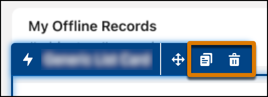
Display a list of objects where start and end times are pertinent data. - Delete or Duplicate Components
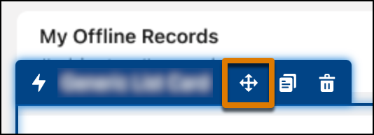
Easily add or remove components to make customization even quicker. - Reorder Components
Quickly change the order that components render on the landing page.
Add an Actions Card
Enable customers to build a place to host their Global Lightning Quick Actions.
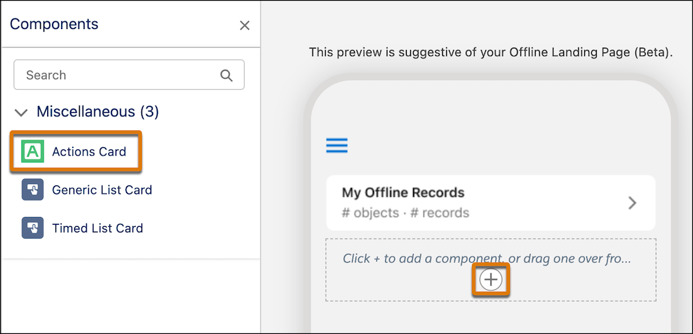
- Select Actions Card from the Components menu on the left and drag it onto the canvas.
- Click the + icon on the canvas and choose the Actions Card option.
On the Properties Pane on the right, you can configure the following:
- Card title
- Actions to appear in the card
- Order of the actions
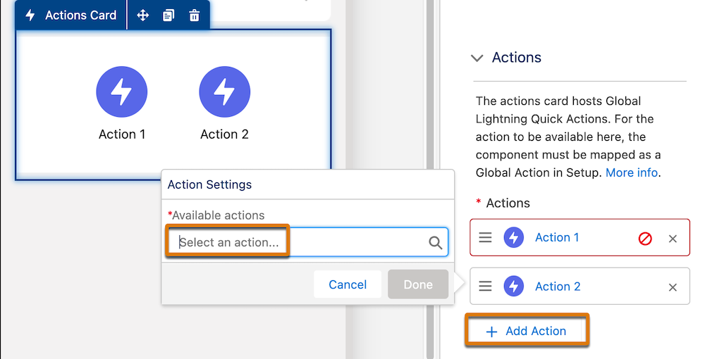
Click the + Add action button then select the type from the Available Actions dropdown menu.
Add a Generic List Card
Let users configure lists of objects with up to two subfields.
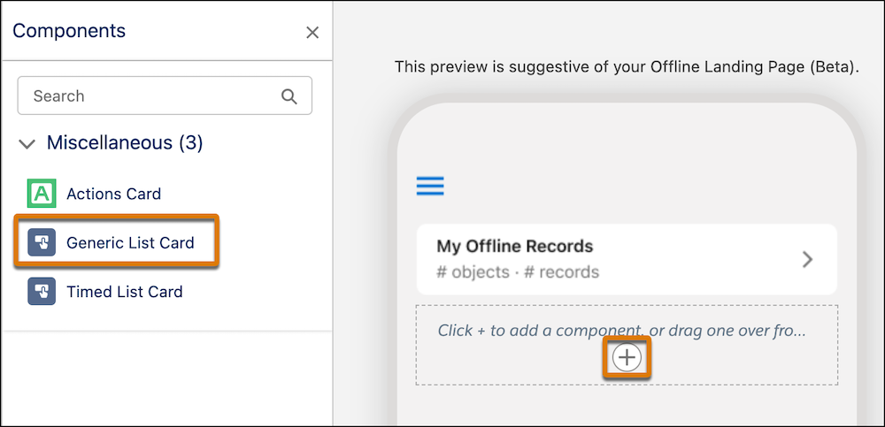
- Select a Generic List Card from the Components menu on the left and drag it onto the canvas.
- Click the + icon on the canvas and choose the Generic List Card option.
On the Properties Pane on the right, you can configure the following:
- Card title
- Object for which to show records
- Order of the list
- Number of records to show on the home page (3-10)
- Field Properties
- Main Field (required)
- Subfields (optional, up to two)
- Icon Properties
- Show (default) or Hide record icons
- Swipe Actions
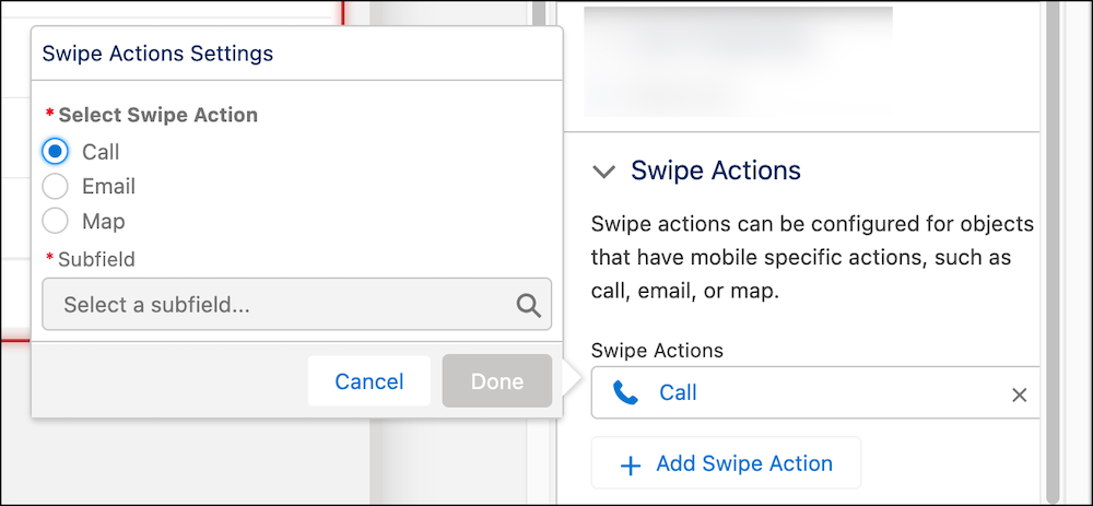
Objects can have swipe actions associated with them if they have subfields that support them. For example, a “Call” swipe action can be associated with the Account Phone field.
- Supported actions
- Call
- Maps
 Note The subfield for Maps must be a text field that contains the fully mappable address.
- Supported actions
Add a Timed List Card
Display a list of objects where start and end times are pertinent data.
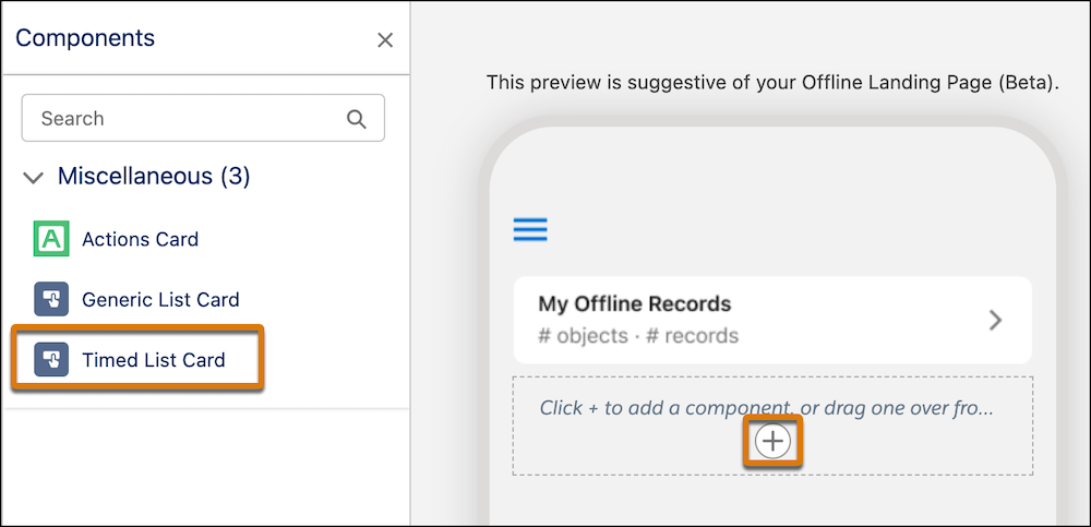
- Select Timed List Card from the Components menu on the left and drag it onto the canvas.
- Click the + icon on the canvas and choose the Timed List Card option.
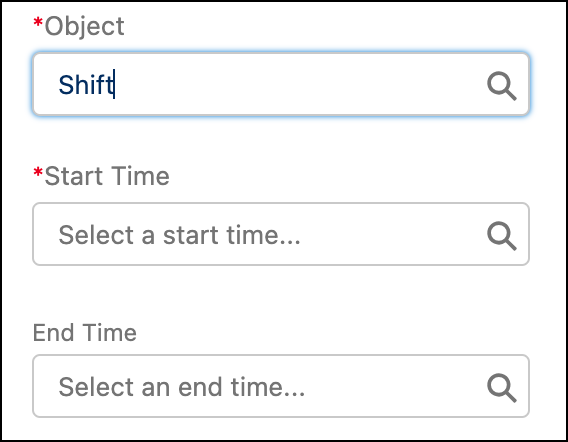
A Timed List card is similar to a Generic List Card and has the same required fields along with two additional fields that can specify the start and end times for an activity.
For example, a Shift object has fields that represent the start and end time for each shift record.